The Commentary - Issue Three
Editors Note: The Importance of Community in Forging the Road Ahead
left column: Heather Hershberger
right column: Neil Martin
Dear Readers,
I write this note to you on November 6, 2024. I need not explain the emotions I am feeling, the cause of such grief, or the pain I am feeling for communities I am a part of or that I am sympathetic to. I cannot begin to imagine the pain of some, and I am a fully realized embodiment of others. I am writing this as a call to action, as a reminder of the communities we have built already.
You will be reading this months after this dark day, and I feel so blessed to be reaching out into that future. I hope some healing has occurred whether it be personal, in your communities, or nationally. If you’ve become complacent, let this remind you.
But I can only speak to today.
Today is a day that reminds us of the importance of what we are doing for each other. Today is a day that reminds us of who we are, who we strive to be, and the obstacles that stand in our way.
Today, I am reminded that I have a voice, that I am a community builder, and I have a platform. I will use this platform as needed. I am reminded ardently of the reasons I started this program eight months ago. Today I am reminded that I must fight actively, every day to live as I do in a typical day before today.
In a typical day, I sit and edit this magazine, formatting the beautiful words of my writers, decide what pictures showcase their themes the most. I reach out to artists asking if they would like their work highlighted. On Tuesdays, I go to Wick Monet, the black-owned gallery that sponsors this paper. I meet with Neil, the owner and my friend, to share everything that is on our minds.
On a typical day, I will go to the immigrant-owned bakery down the street from my house, to grab a pastry and sit next to a crackling fire or in the warm sun. On late Saturday nights, coming home from a queer bar, I watch the baker rise to knead dough in the early stretches of morning, and on Sunday his daughters take my order. I think about the free espresso I receive when dropping off my magazines because the owner believes in the power of art.
On a typical day, I think about how blessed I am to live in an area that allows for space for individuals to exist as themselves. I think about my community built on mutual understanding of innate rights, freedoms, and ideals for any and all individuals within. Please allow me to clarify that when referencing my community I do not reference the governing bodies over it. I am referencing the individuals that weave the tapestry of community. I hope every day that someone who needs to see this magazine sees it, and takes it because it’s free.
Today, I am reminded of those who live outside of my community, actively striving to work against us. Those who would not approve of a queer and POC run newspaper. Those who would shut out refugees because they don’t talk like them. Those who would be freed from prison after insurrectionist acts. Those who wave banners of hate behind pickup trucks filled with guns.
Today, my task is to not let those thoughts overtake me. To remind myself that queer joy, that POC joy, that trans joy despite them will hurt them the most. That I have the power to elevate communities that work against them.
Today, I put my faith in my communities and know they will need support. Today, I vow to be more of an activist in my everyday life.
Today, I promise to become more involved, and use my voice for more.
Today, I hope that you will do the same.
Consider this paper a resource, as it always has been, for good and change. In this issue, I have included resources to support our communities beyond those of artists.
I, and I hope you as well, believe in the healing and activist power of art. I remind you that supporting living artists in their practice is rebellion against a commodity driven economy that only empowers the 1% that has taken over our government.
By buying local, supporting artists, local farmers, and small businesses, you keep Pittsburgh and its culture alive.
Place more value in your labor, and the labor of others. Those who make America run should be running America.
-Heather
Back in 2006ish, I was in the middle of an argument with a high-school classmate, from Seoul, about some of George W. Bush’s policies and actions. I tried to distance myself from the president and he kept repeating, “For the people, by the people.” He was highlighting that no matter what I was complaining about (too long ago to remember), this is my time and it’s my problem.
Like many Black Americans, I am the descendant of forgotten slaves and my family has never lived a day without overcoming burdens placed on them by this country. It was difficult to process that sort of birthright. I couldn’t even vote.
As the days and years passed, I could never shake that conversation.
Theodore Parker used "government of the people, by the people, for the people" back in 1850 and Abraham Lincoln used it again in his Gettysburg Address. Ignoring the full-spectrum lack of equity of the time, as a mantra, it holds water. It names who the audience is, provides direction and it provides the rationale. Most importantly, it provides a context for a sense of ownership to come about.
In 2024 and 2025, that ownership feels really abstract. Politicians are controlled by (x)illionaires. Land is held by faceless companies and our social services have been labeled communist. Our social media and news are largely bought as well. Most of us want to hold a job, be spiritually and socially fulfilled while being able to make plans for our future selves. Our ability to live this simple life is being taken from us. That’s where we are.
Artists have long owned the role of calling out the bullshit in society. We are super flawed – sometimes only motivated by celestial bodies or by commissions. We are inconsistent, but good at doing something when the time calls for it, even if that something is on a canvas no one ever sees. But what is there to call out when what billionaires are pulling is so transparent, racist, sexist, homophobic and cruel?
There are two areas that I believe are essential in making a path toward achieving a brighter future, forever:
First, we need to create more art that reflects the society we want, rather than just attacking what it’s becoming. When we focus on narrating the story as we live it, we risk forgetting that we’re active participants. Social media has normalized living outside of real time. Let’s recognize, rectify that, and move forward.
Second, we need more in-person activities – more parties, more phoneless debates. We must create more opportunities for vulnerability and connection. It’s through these interactions that camaraderie and understanding grow.
Resistance is built on a foundation of familiarity and on the confidence that your neighbor will have your back.
To every artist: this next chapter isn’t on any single person, but each of us can make a difference.
-Neil
“The role of the artist is to make the revolution irresistible.”
-Toni Cade Bambara
Bottom Feeder Books:
A Conversation with Ryan, owner of Bottom Feeder Books
by Vania Evangelique
“Bottom feeder:” a phrase that’s commonly associated with someone who is always trying to make money or someone who spends their time trying to take advantage of someone, whether that be through deceit, harm, or both. Only the parties can truly tell. And yet this term “Bottom Feeder,” takes on a new definition with Ryan at the helm of this quaint bookstore located in Point Breeze. With his intentionality, careful curation of arts and literature, and his continued support of the artist community in Pittsburgh, this bookstore stands in stark contrast to the term’s once-negative associations.
Ryan, originally from Richmond, Virginia found his home here with his long-time girlfriend in 2020. when things were bleak, when there was minimal to no contact with friends and family, and much less the opportunity to discover new connections and new friendships.
When talking about the birth of the store, its name, and its contents: “primarily used books, with a selection of new titles, in art, film, theatre, poetry, [and] literature;” Ryan acknowledged that this dream has been in the works for many many years. Working in a bookstore in his hometown called Chop City Books, he was able to gain skills in appraisal and dive into the arts in a new way. His time spent in New York continued to further cultivate his interest in this world due to its accessibility of culture and life of adventure.
“When we moved to Pittsburgh, it was a new city, a new thing. I didn't know anyone here, just a small group of people. So when we moved here, I decided that it was time to start something new. A whole new life”, Ryan said when talking about opening the store in July of 2022. A process of preparation of finding a storefront, finding books to fill it, and money to sustain it.
His courage and venture into owning a bookstore, which primarily focuses its attention on the arts through a papered lens, has been a new and welcome addition to the Pittsburgh arts ecosystem.
The walls of this venue from top to bottom are covered with books from authors like James Baldwin, Peter Doi, and Nick Waplington, with genres ranging from art history to science fiction, postmodernism, and simply recreated sketchbooks. This carefully curated arrangement of books ranges in price from $10-$300. Anyone who walks through the doors of Bottom Feeder Books has the opportunity to engage with something new or deepen their relationship to something that they have already dedicated their life to.
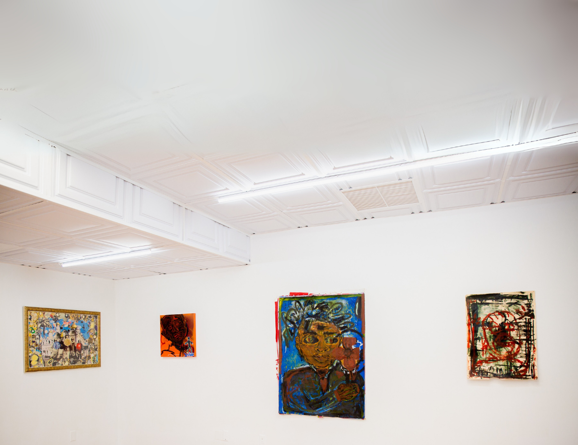
Recess curated by Dominick Mcduffie and featured artists Jewel Justice (works pictured far left), Nasir H Watson (works pictured), and Sager McDill.
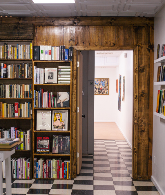
View of Bottom Feeder Bookstore (inside)
Bottom Feeder Books is a bookstore that prioritizes holding space for other practices. From poetry readings and book signings to gallery exhibitions and film screenings, Ryan works to cultivate spaces where people feel welcome to be a part of. Although sometimes wrestling with the balance of it being a bookstore and an event space, he appreciates the multi-faceted events he’s been able to host. “I like to provide a space for people in Pittsburgh, for artists and writers [where they get] to get to all share;” Ryan states. With a preference towards hosting free events, Ryan is no stranger to the amount of work that goes into the craft and is welcome to accommodate admission.
This bookstore nestled into the quiet Gettysburg Street in Point Breeze offers another chance to engage with a new piece of literature. Taking on a new meaning of bottom feeder and transforming it into one that is associated with community, upliftment, and havens around gently used, new, and unexplored worlds of literature across artistic mediums. Ryan, as owner, resident of Pittsburgh, and artisan continues to hold space for those looking to get more involved and cultivate dreams in a new and expressive way. And, most definitely, will recommend a good book to you!
Bottom Feeder Books is located at 415 Gettysburg St, Pittsburgh PA 15206
Hours are Wednesdays through Sundays from 12:00 PM-6:00 PM.
Follow them on Instagram here.
Check out their website here for more information on upcoming events, special book titles, and recommendations.
I Need A Museum...
by Lauren M Salopek
From the outside looking in, at the Carnegie Museum of Art, a series of tall white banners makes an emphatic call for the transformation of the museum as we know it. Andrea Geyer’s Manifest is displayed in the museum’s glass entryway, visible to both the outdoor sculpture court and the wide interior entrance. On the banners, Geyer lists her wants, her needs, and her demands of what a museum should be, and in doing so, calls attention to what it often is not. It’s a call for action that is as plain and bold as its display. No frills, no room for (mis)interpretation, no chance to miss it. I contemplate (and support) Geyer's vision before my visit, while I am at the museum, and in the days following, as I struggle to shape and manifest my response to it into a cohesive written work. Do I call into question whether the Carnegie Museum of Art is honoring Geyer's call for transformation? Do I critique the display as merely performative? Do I offer a hopeful vision of what could be, joining my voice with Geyer's to move our legacy art institutions into the future?
And then the world shifts, and I realize: whether CMoA is doing enough to respond to Manifest is not the question. The question is wider, deeper, with a bigger breadth than that.
The CMoA's website tells us that Manifest arose out of Geyer's research into Grace McCann Morley, founding director of the San Francisco Museum of Modern Art (1935 to 1958.) Morley's vision for the museum, which still feels progressive 70 years later, included a public art library, a television program called Art in Your Life, and operating hours until 10:00 PM. But another influence on Manifest came in 2016, when the results of the US presidential election pushed Geyer to include calls for museums "to be sites of sanctuary and resistance."
“We will need spaces of refuge,
resistance, and sanctuary.”
As I revise this writing in early November of 2024, so too does another presidential election influence the context surrounding Manifest.
I stop struggling with questions of how to properly critique the Carnegie Museum of Art's engagement with Manifest, and whether the vision of its own future is in harmony with Geyer's words. I struggle instead with any vision of the future at all.
I start doom scrolling on social media because it's somehow comforting to know we're all in discomfort together. I start seeing people and organizations– mostly artists and art spaces– offering open doors: free admission to normally-paid events, invitations to simply come and be together, to mourn, to distract, to laugh, to plan. I see plans for rest, mutual aid, and organized resistance. I see the word "community" pop up more times in a day than I've seen it in months combined. I see a movement that is tangible and not performative. I see a mass understanding of what is needed in this moment, and a rise to an unspoken bid for action, however small that action may be. I see what Geyer is calling for in Manifest happening in real-time, and I stop grappling with questions of whether or not the Carnegie Museum is responding properly to her work, because at this moment, that question doesn't matter: we already are responding, elsewhere, outside the museum walls.
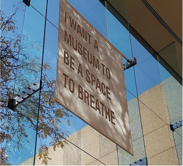
Manifest, Angela Geyer
This moment will require the kind of radical action that Manifest calls for. We will need spaces of refuge, resistance, and sanctuary. We will need community to support us, for our physical and political needs, yes – but also for our spiritual and mental needs. We will need space to breathe. We will need space to find joy and beauty. We will need spaces to rest from the fight, or to prepare to return to it. Our creative spaces, already so accustomed to welcoming the outcasts and overcoming adversity, are perfectly poised to rise to this occasion. They are already doing so. They have been some of my only comforts in the days since the election results became clear. I have every reason to believe they will continue to be in the days ahead.
All of this has shifted my view on Manifest, and the context of what the museum could be. I think that Geyer's museum exists, or is in the process of coming into existence, right now – but it's not in our legacy institutions. It's in the little art gallery with the rickety stairs leading up to it. It's in the tattoo shops with the progress pride flag in the windows and the familial atmosphere inside.
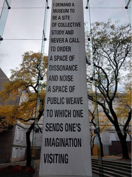
Manifest, Angela Geyer
It's in the community gardens, the oddity shops, and the tiny rundown music venues. And what a beautifully appropriate manifestation of what Geyer envisions in her work this is. What she's asking for is progressive and wide-ranging. It's bold and varied, with demands for places of peace and places of disruption, a space for abstract dreaming, and a space for concrete action. The text of Manifest is vast enough in its demands that no two museums displaying the work offer the same collection of words. Every creative space can offer the demands of Geyer’s, but no two places will do it in the same way. In one place you might be organizing politically, while in another you may be giving yourself and your community space to create and unwind from the rising tension. And in a third space, you might find art that blends the two together.
Manifest is a tall order. It's a bold demand and a big dream to ask of any entity, and I applaud Andrea Geyer for doing it, especially because it directly confronts large arts institutions that are often too entrenched in their ways, and the business of it all to fully respond in the way she implores them to. It's not that I think museums, in this case the Carnegie Museum of Art, can't meet Geyer's demands. It's just that it's simply not up to me to decide. It's up to the CMoA, and any museum that displays Manifest on its walls, to decide if they will take the project's words to heart. Until they do, and even if they don't, I still see Geyer's words becoming a tangible reality around me. Small, independent artists and art spaces are doing important work, work that soothes our souls and liberates ourselves amidst political adversity. With the words of Manifest hanging in their windows, the Carnegie Museum of Art has an open invitation to join us. I want them to join us. I need them to join us. I demand that they join us. Because it is going to take all of us to ensure that the kind of space Geyer imagines can come into existence, and then continue to exist. It is going to take all of us to manifest it.
The Static After the Disaster
by Layne Shaffer
It’s not every day that you get to work with twenty-four talented artists – with all the passion and inspiration they inject into their work. And from here I realized the true depth of artists working in Pittsburgh: they’re underground, underappreciated, and, again, extremely talented. It’s not every day that you get to do it all. From beginning to end.
This summer I worked as a fellow with the University of Pittsburgh at the Associated Artists of Pittsburgh. My role was to be the assistant curator and point of contact for the 2024 New Member Artists working with Executive Director Madeline Gent. What is a ‘new member’? Associated Artists of Pittsburgh represents over six hundred artists working in and around Pittsburgh– offering them support in their artistic practices and hosting exhibitions in order to do so. Membership is achieved through a juried process. Once members are accepted into the organization, they are invited to exhibit work in an annual new members show. This is where I came in.
I worked alongside juror and assistant curator of the Carnegie Museum of Art, Alyssa Velazquez, to select works for the show. I scoured through any and all material and context the artists provided (oftentimes taking an extremely deep dive into their websites and Instagram profiles) to provide each artist and work with an engaging and encompassing wall label (including biographies and contextual information about the work). I aided in the layout and curation of the show, asking myself these questions: how would the work of these twenty-four artists be best displayed? What themes are there, and what contradictions are here? These are important questions for an exhibition that (by design) has no unifying “theme.” I aided in the installation of the show, assisting in artwork drop-off and point of contact for any questions or concerns artists had in the interim. I developed programming for the exhibit: a clay workshop with two wonderful ceramic artists – Juliet Phillips and Liz Wells. And, an artist talk with two other artists in the show, who both explore themes of American exceptionalism and its mythologization – Jamie Walters Kessler and James Louks. Working with living artists is very fulfilling; on a daily basis I see how my work affects these artists working in the very region I call home. Being able to provide artists with opportunities and support is my driving mission in the work that I do.
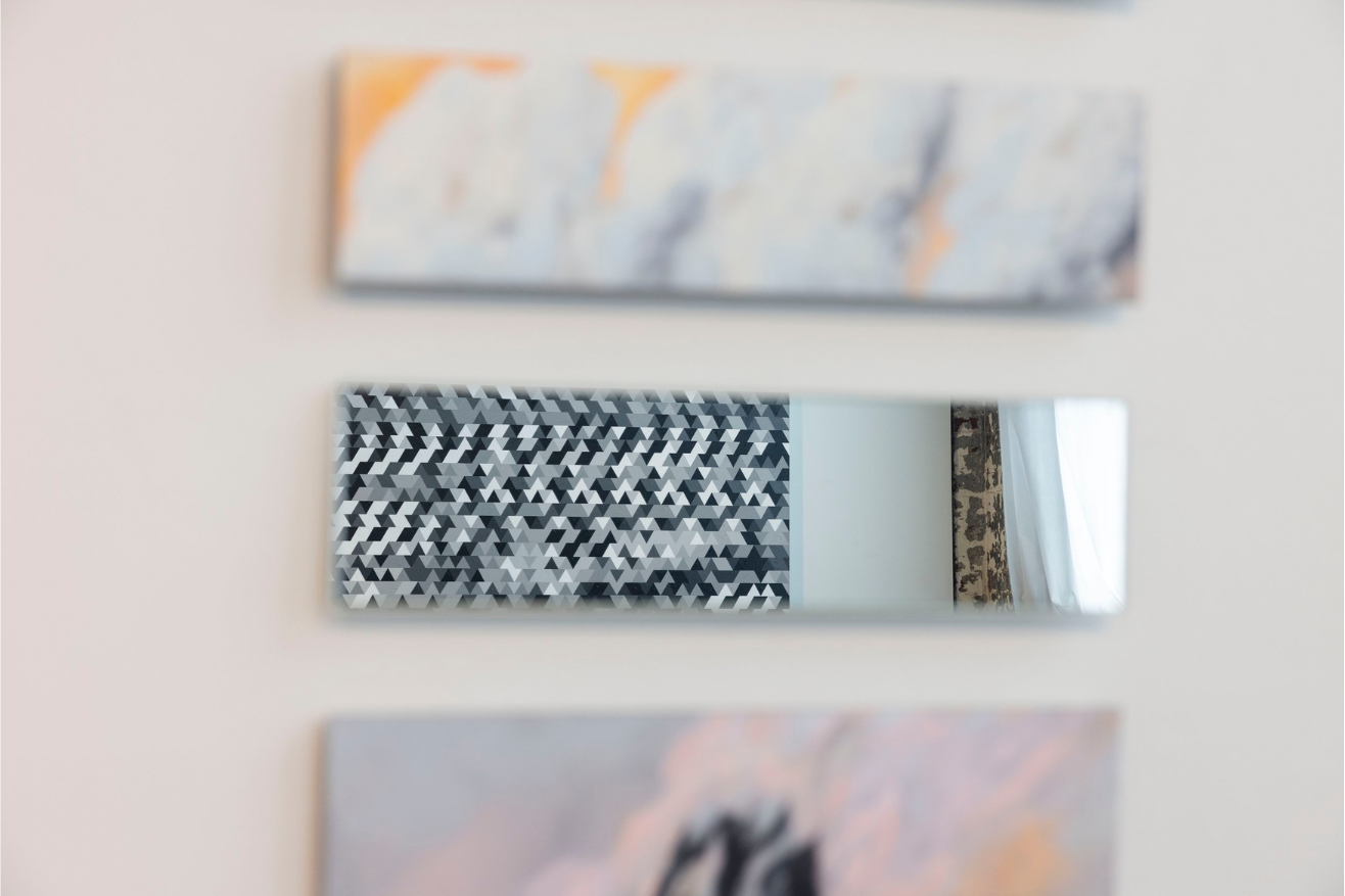
Michael Begenyi, Rift, 2022 as seen reflected in the mirrored panels of Jamie Kessler, Possible Skies and the Weight of Realpolitik, 2024. Photo credit: Chris Uhren
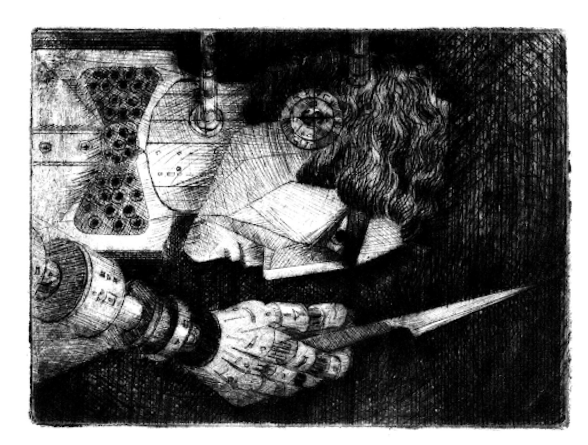
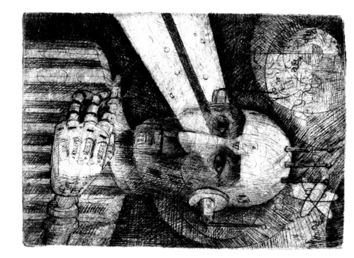
From left to right: Dennis Moran, Cyborg Radiologist, 2023; Dennis Moran, Cyborg Reconstructive Surgeon, 2023
Now, for a virtual transportation into the exhibition (if only I could take all of the readers there in person!). To follow are the most insightful curatorial decisions I was able to make as assistant curator, as well as some of my favorite works contained within the show.
In close proximity, directly facing one another are three works from a series by Dennis Moran titled Cyborg Radiologist, Cyborg Reconstructive Surgeon, and Cyborg Medical Oncologist, 2023 as well as Ghost Stories, 2023 by Lisa Toboz. In his Cyborg series, Moran studies the medical industrial complex — creating a set of cyborg medical professionals whose primary aim is to provide the most expensive medical care, not the best. Hardly do these cyborg professionals provide valuable care to their patients.
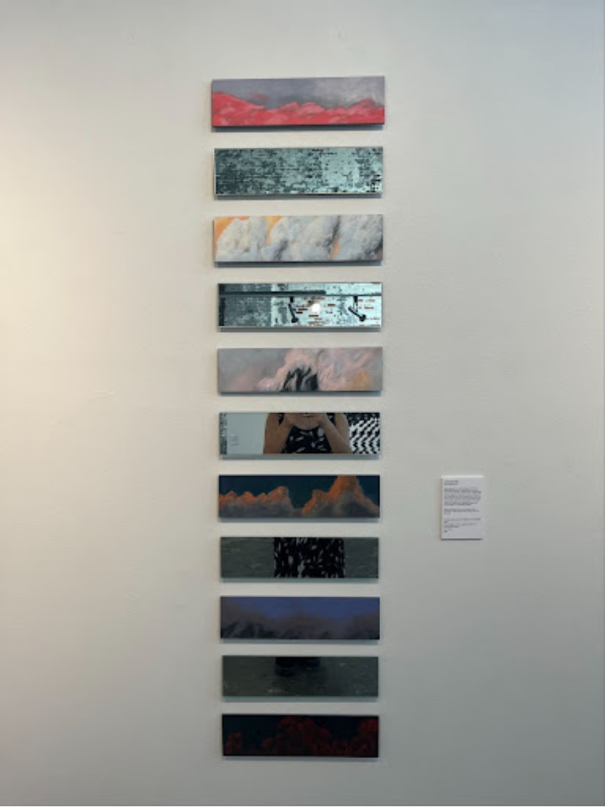
Jamie Kessler, Possible Skies and the Weight of Realpolitik, 2024
The cyborgs are cold, calculated, and often wield their medical tools as weapons. This series came out of the five-year-long cancer treatment of Dennis’ late wife Margaret, a commentary on the state of care she received at that time. Lisa Toboz uses self-portraiture as a form of healing. Inspired by Victorian spirit photography during her battle with lymphoma, Toboz found comfort in spirit photography’s goal of capturing the spirits of deceased loved ones. This space is explored through her Polaroid photography— creating a liminal space that holds the existence of memories, loved ones, and perhaps herself. As these works face one another, they capture two ends of a spectrum: the artistic production that handles grief and loss.
On opposing walls facing one another are Possible Skies and the Weight of Realpolitik, (2024 by Jamie Walters Kessler) and Rift, (2022 by Michael Begenyi.) Possible Skies consists of acrylic panels with alternating mirrored glass panels. Each acrylic panel is painted with a sunset or sunrise, a symbol of the ending of a day or the start of a new one. Kessler sourced these scenes from news broadcasts of wars and disasters on CNN and NPR. The alternating mirrored panels force the viewer to confront the role of the individual in scenes of war. It is unavoidable, as is the duty and relationship that every human has to world crises. Opposing this work is Rift, a monumental abstract acrylic painting. Begenyi often incorporates math, science, and geometry into his work. Here, Begenyi explores geometric repetition inspired by images of TV static that he had taped in his studio. Rift explores the human tendency to notice patterns, anomalies, and repetition. When the viewer stands between these two works, Rift is seen reflected in the mirrored panels of Possible Skies. The viewer turns, and these beautiful sunsets are replaced by static. Wars begin, war end, disaster happens, lives are lost. The beautiful skies are lost – the TV cuts to static, the broadcast has ended.
Though this exhibition has since closed, I recommend readers go to aapgh.org to check out images from the exhibition as well as the artists that were featured.
Art along the beaten path: Exploring murals in Lawrenceville
by Renee Dubaich
In Pittsburgh, art is never confined to one distinct space. You can’t help but notice it everywhere. I see the streets bloom with creative force, people yearning to turn any old, monotonous building into a canvas. One way art is brought into public space is through murals. For most of us, streets are how we get from one place to another. Murals are meant to be seen along these routes taken in daily life, encouraging us to stop, breathe, and gaze. I recently moved to Lawrenceville and have been making an effort to become acquainted with the neighborhood—specifically its artistic side. I asked myself: what art is around me that I hadn’t noticed before?
I rode my bike, darting from street to street in all directions with my eyes attentive to the sides of buildings, searching for murals. It was a dreary and overcast day where the colors were much more vibrant and potent against the grey sky. Some murals are placed on busy streets such as Butler to reach the eyes of many people. Then there are murals in places where you least expect them. Tucked away in Lower Lawrenceville along 35th and Charlotte Street, I stumbled upon an abandoned warehouse-turned-outdoor art gallery.
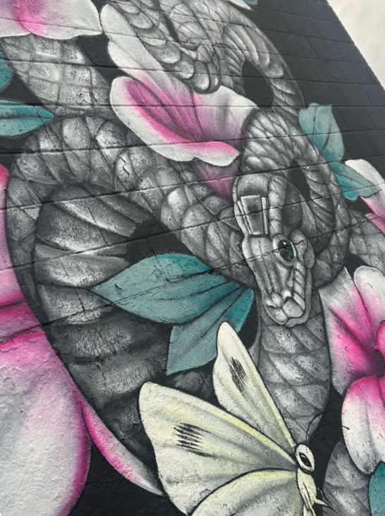
The first piece I saw was by Amandalynn—a pitch-black background illuminated a grey serpent slithering among pink and white hibiscus, teal leaves, and a pastel yellow butterfly. The serpent’s scales were intricately balanced with shadows and highlights, and the eye was subtly brushed with deep green. The paint was smooth, like the softness of chalk, and balanced with the patterned disruptions from the creases and rough crackling of the cinder block wall. It reminded me of the joy felt from the first blossom of spring, instilling life into this abandoned warehouse.
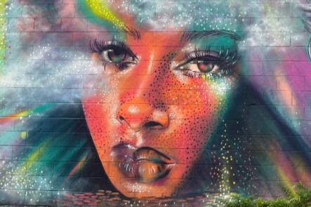
I turned onto Mulberry Way to find another warehouse with a glittering portrait of Marilyn Monroe. The Pittsburgh artist behind the piece, Ashley Hodder, captured the ethereal on a seemingly dull surface. Along with Marilyn was the face of another woman and a single eye. Hodder used pointillism to embellish flesh as if it were made of sequins. The portraits emerged through light clouds and the aurora borealis. I was mesmerized by the chartreuse, magenta, blue, and coral. This mural caught me in awe. Their eyes stare back at me, and I imagine I too am bathed in a colorful storm. Isn’t art much more memorable when you find it places you least expect it? You, of course, visit a gallery with the expectation to look at art, but what a joy it is to be walking and notice on the backside of a seemingly plain grey building, there is a world of color!
I ride back onto Butler and across Frankie’s Extra Long, in a small parklet with unkempt grass and two painted benches, I am caught by another female portrait. The Pittsburgh mural artist Jeremy Raymer painted Evelyn Nesbit, the quintessential ‘Gibson Girl,’ with a purplish-white complexion and two bright yellow sunflowers adorning her head as petals fall away wistfully. Looking closely, you notice Raymer's deft technique with the spray paint. I admire his intuitive use of cross-hatching and jagged movements.
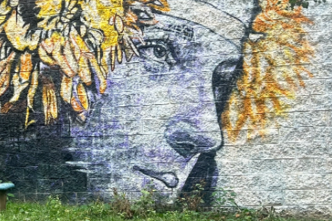
When you look closely at murals, you notice that they are not perfect. They fade and will not stay as vibrant forever. This feature may be seen as a disadvantage in non-street art, but one could argue that the ephemerality of murals is what makes them so alluring. The art ages, but isn’t it beautiful how they can fuse with the environment? I find this to be true in Raymer’s mural as it looks like it has been here for a long time. The porous brick is prominent through the paint, and overgrown grass shrouds the edges. It no longer looks superficially placed but is integrated into the landscape. But I couldn’t help but wonder: why a snake, why Marilyn, why Nesbit? Without any accompanying text, it’s hard to tell why the artists decided to paint these specific images in these specific locations.
Although I am certain that murals like these encourage us to be more attentive and curious about our surroundings. I felt like a cartographer as I was pinning the murals’ discrete locations into Google Maps, discovering parts of Lawrenceville that were previously in my blind spot. These artworks invite us to find a deeper connection to the cityscape—to engage with streets not just for the purpose of transportation but also as spaces to explore. Murals are an accessible form of art in terms of both cost and time; they require no fee and no specific time when you can see them (that is until they fade away). I read that Pittsburgh has over 200 murals, and I encourage you to look out for them. You never know what you’ll find around the next corner.
To learn more about the artists mentioned in this article, visit: www.alynnpaint.com, @ashleyhodderart on Instagram, and www.jmraymer.com.
by Dï
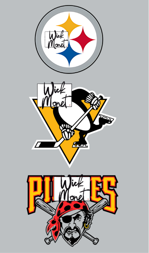
Anybody in Western Pennsylvania can tell you the archetypal tale of Pittsburgh: a once-great industrial citadel brought to its knees by a crashing economy, then reborn as an abstracted, techno-healthcare oasis. The death of smoky, “hell-with-the-lid-off” Pittsburgh has given the modern city some great vestigial structures though, with the most famous likely being Pittsburgh’s sports teams. For a city similar in size to Des Moines, Iowa, I find it unbelievable that our city gets to host three billion-dollar-organizations every year. Rightfully so, sports have become an integral part in the social fabric of yinzer culture. To honor Pittsburgh’s athletic prowess, I would like to analyze the logos of the various sports teams from the city, to bring a deeper understanding of what they are unconsciously representing and how they fit into the larger context of art criticism.
If the identities of Pittsburgh sports were a _______, the Pittsburgh Steelers would be the__________. Their branding has remained virtually unchanged since the early 1970s, when they debuted their red, blue, and gold crest as an homage to US Steel’s “Steelmark” logo. One of the most basic “fun facts” about the logo is that the
weaving. felting. gardening
Check out my classes, projects, and store at: www.redcottagefiberstudio.com
stars are actually called hypocycloids, and their colors represent the ingredients for steel (red for iron, yellow for coal, and blue for scrap metal). Artistically, this logo goes against many of the rules in modern graphic design: the logo colors don’t match the team’s colors, the concept is fairly abstract from the identity of a steelworker, and the font is squished and formatted more like Charli XCX’s “brat” album than an imposing script. I think that’s why it works, though. The Steelers are not trying to corner a hip, young market or up their merchandise sales. What you see is what you get, no pageantry required. What is more Pittsburgh than that? For my more artsy readers, if you want to appreciate works similar to the Steelers logo, I would say look towards the works of Robert Indiana. Indiana was a pop artist in the 20th century whose work often incorporates bold themes of repetition, industry, and confrontation. The Steelers’ identity of blue-collar, brash football embodies many of the same themes present in Indiana’s extensive body of art.
The Pittsburgh Penguins, in my opinion, have the best logo in Pittsburgh, and arguably, one of the best logos of any sports team. As many people will point out, in the logo, the golden triangle behind the penguin references the “Golden Triangle” or downtown neighborhood of Pittsburgh. It is very difficult to make a penguin look intimidating, but the sharp angles and of the logo do just that. In fact, the downward-shape of the triangle provides a frame that the penguin can then fill in to. The Penguins brand often explores this line between intimidation and whimsy. I am reminded of The Fool card in a tarot deck: many believe that The Fool (the penguin) is an inept dunce. Actually, The Fool has no weakness, for they are not chained by the structures of success or failure. The Fool is able to be what they are, and that is their supreme strength. Perhaps it is no coincidence that the silly penguin is now the mascot to one of the most successful hockey teams in modern history.
The title of “black sheep” of Pittsburgh sports definitely belongs to the Pirates. Even though they might be the least successful team in the city as of late, they have more history than most professional sports clubs in the country. The Pirates official logo is the yellow “P” that adorns their cap, but their alternate logo, a snarling pirate head in front of crossed baseball bats, is a lot more dynamic (and frankly provides me with more to analyze). Unlike many anthropomorphized logos which face either to the left or the right, in the Buccos’ logo, the pirate is staring at you. This level of confrontation gives the logo an omnipotent, imposing feel. I am reminded of the façade of the Palazzo Braschi during Mussolini’s reign. The pirate wants to be in control of all. Perhaps it is compensatory?
An Artistic Analysis of Pittsburgh Sports Logos

Going with the Barrel & Flow
by Shawna Carter
Doses of vitamin D were plenty joyful at the festival of Barrel & Flow on Railroad Avenue housed in Pittsburgh’s Strip District. I sat at a sunlight-colored table amongst a plethora of libations enjoyed by alcohol connoisseurs of all shades and ages. Though our demographics varied, we were all connected by the energy of collaborative creation making for a melting pot of opportunity for those inspired by our differences. As I embraced a moment of stillness despite the ongoing excitement surrounding me, I appreciated each of the interactions I’d made with those in their era of elevation and began to note the origins and goals they shared freely;
…as their stories became a chapter in my search for purpose.
The many connections paired perfectly with the tastes, sounds, smells and visuals of the event, making for a sensory celebration. As I sat and savored maple glazed bacon, I glanced at a friend enjoying his moment in the sun as the rays lit the stage, predicating his emergence.
Rian-Louis McNeil, a Pittsburgh-based creative and entrepreneur, partnered with a local brewery, TLC Libations, to create the RiMosa, a signature cocktail encompassing spirits of R&B music. The striking magenta hue is enough to catch any wandering eyes, still, the taste provides just a kiss of what Rian describes as “…bold, vibrant and loving… That’s what I want it to be wrapped in.” During a brief interview, he mentioned his business partner Erica Turner and her company, TLC Libations, is the only black woman-owned distillery in Pennsylvania. Knowing this, I became even more elated for the success of my friend, who is a member and proud promoter of the LGBTQ+ community and a fellow black woman in pursuit of her goals. In this moment, I had to proudly raise my glass to our shared fearlessness and support of one another.
Cheers to every win
(Be it big or small, my friend.)
Feeling uplifted, I gazed at the open blue sky… clear of any powder white clouds as if it were a canvas for creatives to use freely. I enjoyed the poetic process of a live painter as she stroked to the harmonic sounds of the band, just around the corner, and thought of how our energy syncs with those we are meant to connect with immediately.
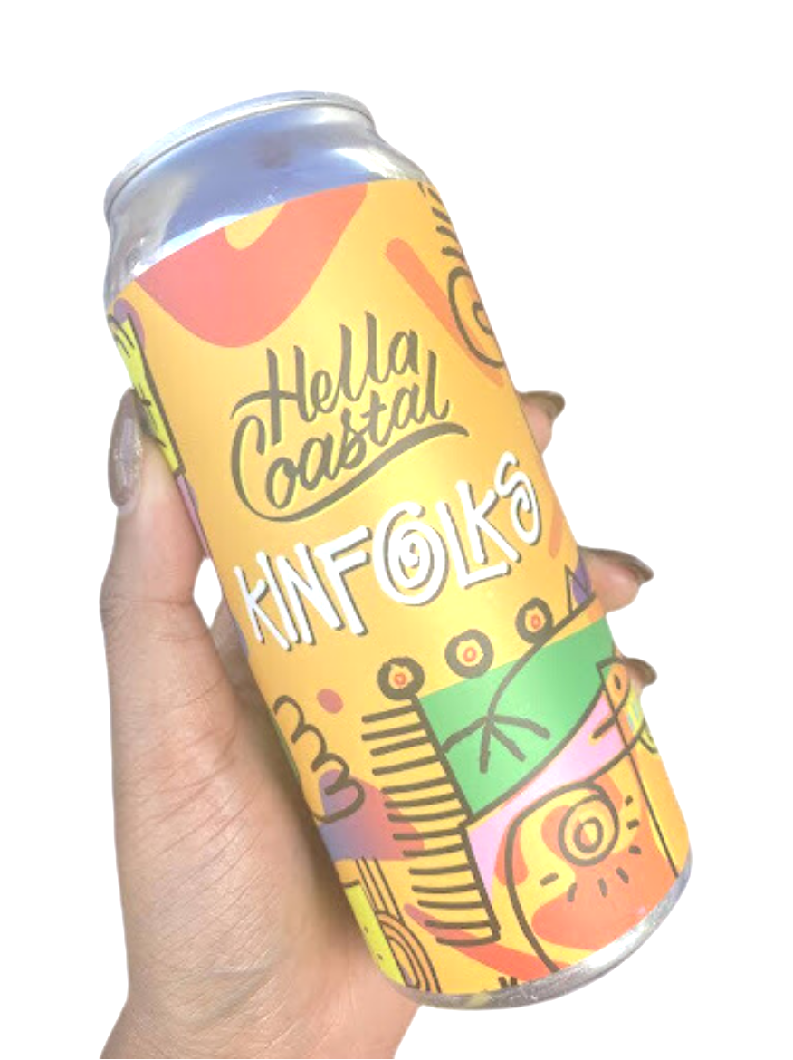
Ironically, listening to Jazz, owner of Hella Coastal Brewery, and experiencing the unique art displayed on his products, had the same effect. Based in Oakland, California, Hella Coastal was born of its owner’s love of home brewing in 2019. Jazz now operates a fully functional distillery in his native town and traveled east to expand the coastal culture. As he shared his company’s origin, I admired the workmanship of his brand images; each invoking its own emotion prior to consumption.
“Yeah, that’s our Juneteenth can, I call it Kinfolks.”
“The polar bear one, that’s Ice City and has notes of white gummy bears!”

“In these spaces, with other creatives, we are inspired to bloom amongst all of our differences and can only be judged by our own interpretation of who we want to be.”
While still in hand, I’d examined the artistry of Kinfolks as Jazz treated me to his stories of Californication. The image was of joyous yellow backdrop complete with shapes dressed in colors that signify African pride and family. A polar opposite, Ice City included peeks of holographic foil of blue and silver amongst a cartoon-esque arctic bear dripping in jewelry; providing an entirely different, yet necessary, perspective of the black culture. I was then informed that the artist, Julia Vann, created both images specifically for the brand and remains part of a movement that has spread its cool coastal ideals in an environment where, sometimes, only a cold shoulder is offered. Today, we welcome each other with warm embraces.
A smile, just as comforting, from my friend, met my eyes as we departed from the lemonade-lined seats we’d become so accustomed to. Sweet memories and smells alike were leading us toward red velvets and pound cakes wrapped in the sounds of Reggaeton. As flavor filled our bodies, we allowed the music to fuel our souls as we explored the festival. In our short yet soul-filling travels, I couldn't help but notice Imani Batts’, designer and owner of Catherine Trendz, radiant aura.
I decided to let her be. TO SHINE.
I circled the festivities searching for Imani’s featured beverage, Peachy Trendz, made in collaboration with local brewery Velum Fermentation. The drink, a cobbler-flavored ale, was an exciting surprise following the designer’s GRWM fashion show which fused the significance of the black hair store with the pride of black culture. During her social media announcement, the creator described the flavor as “a late September evening in the backyard with your favorite people” and the artwork mirrored the comfort food characteristics perfectly. The image, a peachy-keen homegirl next door reclining comfortably atop overgrown signature fruits, was created by muralist Melanie Royster. Simplistic at first glance, further observation invites onlookers to trust the process in progression as it becomes apparent that the logo “Peachy Trendz” is actually thread handled by the melanin model!
Unexpectedly, I found a peer, colleague and friend moments before my exit. Ever sure of her purpose, she too, shined her aura unapologetically. I thought of how we each were fearful of what it was to share our artistry prior to allowing ourselves to flourish in the garden that is our community. In these spaces, with other creatives, we are inspired to bloom amongst all of our differences and can only be judged by our own interpretation of who we want to be. I embraced her as we said our goodbyes, understanding well that we are…
…Simply being is enough.
Artist Workshop with Juliet Phillips and Liz Wells
by Mercedes Perez-Shillington
On the first Wednesday in the first week of my last semester in college, I found myself in the unlikely scenario of carrying around paper plates spotted with craft paint in the Associated Artists Pittsburgh galleries. I had found myself in this scenario in the way that the most time-worthy events in Pittsburgh are advertised: a combination of word of mouth and Instagram.
Our goal for the evening was to create large memory lockets. Available, as I and ~20 others worked, were ceramic artists, Juliet Phillips (@jrp.cool on Instagram) and Liz Wells (@iovemyuglyson on Instagram), new members of the Associated Artists of Pittsburgh. Both of these artists have clay sculptures in the New Member Exhibition currently on view which tap into “clay’s ability to capture memories, give them physical form, and safeguard them” (@aap_pgh Instagram).
With this in mind, my roommates, friends, and strangers got to work on our memory lockets and trinkets. Next to me, someone was working on their perfectly round, smooth locket with wetted fingers. Across from me, someone was giggling with their friends as they carefully rolled tiny cylinders to ornament the circumference of their oval to create an intricate rococo locket. She would eventually paint her locket a fantastic neon green. Among my own friends, squished at the end of the table, Heather worked on a braid for the outside of their sunny medallion, Zena made a pearl lines for their moon frame, Layne made a palm-sized pink cowboy hat, with its own little cowboy sitting on its dome, and Darren made a skillet complete with bacon and eggs.
Above us, Juliet Phillips showed us how to form a solid ball with no air pockets and work the clay with firm fingers into slabs, instructing us on scoring and slipping when we wanted to attach pieces of clay together.
In my own hands, I was working on a slab, adding small rectangular doors and windows, rolling out thin lines for rooflines and chimney trims in the fashion of our home in Pittsburgh. I did my best to recreate the old Bloomfield home with its three stories of windows, and small gable, complete with one of my roommate's cats sitting in the window that she frequents. On the back, I wrote out the street name and included a rectangular cut-out to be filled with a picture of us in the future.
As my friends and these friendly strangers introduced themselves, joked around, and worked I was reminded of the times I had spent in grade school art classrooms. Playing the soft clay, I was moved by the collection of humanity so intently focused on their work.
It is almost inevitable that as one works on something with intent, especially a locket, a keeper of memory, that they pour energy and emotion into the object they are manipulating. With a tactile material like clay, each manipulation of the medium is a squeeze and a caress and a pinch that takes muscle and sometimes leverage. Left behind are fingerprints and the indents of knuckles.
Wells’ work in the exhibit sat on a pedestal as we worked in the gallery. She called them her “big beautiful vessels to hold big beautiful grief” (@ilovemyuglyson on Instagram) as an archival object holding the complicated emotions of love and loss and memory. In her statement about her work, Wells says “each ceramic piece becomes an object that I hold close to myself physically, to feel spiritually close to you” (https://www.lizrwells.com/about).
Phillips’ sculpture, “Barren Girl” is animated in form and illustrated with whimsical fine line drawings. The work is figurative and feels comforting in its simplified shapes. Emma Rivas’ review in Petrichor magazine of Phillip’s says her work “should be in an art terminology textbook next to the word ‘expressive’” (highlight: Get Out From Under the Rock). Her sculpture series of female bodies decorated with illustrations is intimate and connects identity with memory and story.
Both of these artists create beautiful ceramic pieces that carry the emotional weight of their creations. It was poignant to participate in my own emotive creation alongside these pieces and others while being able to talk to the artists themselves.
Make sure to check out Associated Artists of Pittsburgh on Instagram at @aap_pgh and their website at https://www.aapgh.org/ to find more artist talks, artist workshops, and exhibition openings in the near future.
Discussing Beauty and Ephemerality with Carol Kumata and Tadao Arimoto
芸 [Gei] : The Beauty of Ephemeral and Eternal at Contemporary Craft
by Pria Dahiya
Endurance and longevity are the quiet constants in any craft. Contemplating the objects on display in 芸[Gei] : The Beauty of Ephemeral and Eternal at Contemporary Craft means not only delighting in their aesthetic charms but considering the technique, materials, methodologies, traditions, and relationships that allow for these object's existence
Gei is a complex show, a triumph of intense collaboration between the four artists— Carol Kumata, Tadao Arimoto, Yoko Skein-Bove, and Miwa Neishi— and Sogetsu Pittsburgh, led by Reiko Nakajima and Atsumi Sewell. There's an educational component to the show, an installation aspect, a programming aspect, and over 47 individual works on display. But the show remains balanced, and the gallery, peaceful. I am not one for going to church, but sitting in silent contemplation of these structures— vases, tables, chairs, cages, bark, tree trunks, flowers— is a close second.
Many clever details stood out to me on my second and third visits. The contorted, double-trunked dead tree stump which greets you to your left when you enter the gallery rhymes with Miwa Neshi's jovial little ceramic forms. A plane of hanging bamboo— which Director of Exhibitions Yu-San Cheng informed me were cut from a friend's backyard— supports the signage, while floating, looping wood shavings hang from the ceiling structure. It's easy to sit in a corner and let the overall arrangement of the room work it's magic on you.
The floral arrangements in the exhibition are changed out weekly by Sogetsu Pittsburgh. Sogetsu is a school of Ikebana— traditional Japanese flower arrangement— developed by Hiroshi Teshigahara in the early 1920s. It builds on traditional rules and techniques believing that once Ikebana techniques have been mastered, the artist must look beyond the flowers, reeds, and leaves of traditional Ikebana and introduce arrangements utilizing wood, sticks, man-made objects, and more.
The varied materials, in this case, are masterpieces of woodworking, ceramics, and metalsmithing activated with natural materials like wood shavings, sticks, and florals. On the floor of the room are piles of branches and logs strewn with Carol Kumata's metal structures. There are four long tables composed of simple stands with slabs of rough-hewn wood, peeling bark still clinging to the ledge. On the surface of these tables are playful little ceramic creatures and rich, glossy vases. There are two tables adjacent, left empty— the table being the artwork itself. And if you turn where you came in, there are flowers. Bursting bunches of chrysanthemum, juniper, driftwood, and bittersweet vine.
In my first visit, the floral arrangements barely registered as I desperately circled each vase trying to ensure I had seen it from every angle and in every light. The glazes are so luminescent, and the shapes so free, it felt wrong to not give each form the time of day. Visiting again, the florals began to activate the objects and even personify them for me— in Neishi's Haiku, a branch popped out like the sculpture was having bright idea. In Dancer, the vibrating lines were kept safe and shaded from the elements by a large parasol-like leaf.
I have not yet seen Yoko Sekino-Bové's Obsession with a floral arrangement, but I don't think I will. This standout work is both vase and flower, and will provoke a head shake and “How did she do that?”, from anyone with a passing understanding of wheel-throwing and stoneware. Yu-San informed me that Sekino-Bové was inspired by tulip bulbs and tulip mania, the period during the Dutch Golden Age when the prices of certain tulip bulbs skyrocketed to astonishing levels. If you murmured and clucked at the cunning biomimicry of Beate Kuhn's sculptures at the Carnegie Museum of Art, you will appreciate the evenness of the layered bulbs and the small carvings underneath the surface manipulating the reflective lusters.
The other two artists, Carol Kumata and Tadao Arimoto, work in metalsmithing and woodworking respectively. Kumata is a sculptor living and working in Pittsburgh who retired from a 42-year teaching career at Carnegie Mellon University’s School of Art in 2021. When Kumata met me at the Gallery, she was warm, excited and engaged in discussing the process of fabricating and exhibiting the two bodies of work she has on display, Micro Macro (1993) and Micro Macro Part 2 (2024).
I was intrigued by the choice to display such airy, light-filled sculptures on the ground, and the decision to embed them in the heavy pile of logs. It was an effective visual contrast and spread dramatic latticed shadows across the gallery floor. “For this exhibition,” Kumata explained, “we changed the way the works were originally exhibited. We put these logs there as they kind of looked like tidal pool debris, something that might wash in with the ocean. These objects [the structures of Micro Macro] to me had the feeling of treasures you might find on a beach.”
Working thirty years later to create Micro Macro Part 2, Kumata told me she used the same techniques she used on the original set of structures. The only thing that changed were the materials and shapes. This new body of work is round and brass, with lovely gradations in tone and color from silver soldered joints.
Being in the presence of an artist with such great connection to this place and such vast knowledge of her craft was a true privilege. I loved hearing about her memories of Pittsburgh, her wistfulness at the cheap price of steel— “when I first moved to Pittsburgh, man, you could just get dirt cheap steel anywhere, I mean, it was incredible”— to the relationship between craft and demographics. “Because this is such a working class blue collar history in Pittsburgh— well. not so much anymore…” she explained, then chuckled. “But! there's was always appreciation of the work of the hand and of labor in general. Doing manual labor means you appreciate the things that are made that clearly look like it took time and some amount a skill— a respect for a tradition, which is a good thing for the appreciation of craft.”
I certainly agree, and this is one of the things I appreciate most deeply about Pittsburgh's arts scene. Having seen the overwhelming popularity of Marie Watt's Pittsburgh-specific steel beam masterpiece Land Stitches Water Sky over the summer with our community, I have come to truly believe that Pittsburghers are hungry for work that directly references our city's material histories and cultural memory.
Tadao Arimoto was similarly wise and graceful. Entering his woodworking studio my nose was filled with the smell of fresh wood— a smell I didn't know existed but I lack any other term to describe it. Arimoto is a thoughtful, gracious, and deeply intelligent woodworker whose work can be found in every corner of this city. I was visiting a friend living out of an old convent in Braddock this month and in one of the rooms, lo and behold, was an Arimoto desk, signature sticks poking out and supporting below.
Tadao’s work “draws on the beauty and strength of organic structures”, his signature gathered-stick legs being one of them. “I see so much that's artificial”, he shared, “so much simple geometry, around me. Like a monitor, iPhone, cellphone, paper, table… they're all flat and 90 degrees. In nature, each tree, each leaf has a different shape. This variation is important to me.”
I asked him about my two favorite works on display in Gei— two Lotus-shaped Stools and Squibnocket Stand, a one-legged side table grounded with a rock.
“When you are purposely creating a shape, rather than using the natural edge derived from the material, where are you finding inspiration?” He cited nature as inspiration of course, but also insisted he “doesn't try to get that close to the realistic shape… I just don't have time!” His eyes lit up as he explained to me how the chairs, made of cherry wood, will change color over time, going from pale wood to reddish brown, even beetle-black. He had a slight delight when speculating how the stools might be be hit by a petulant child in the future, how scratches and dents would appear on its surface.
“Those are all part of the history of this material” he shared, “this wood exists for hundreds of years, and I only encounter it for a short time, and it goes on to exist for another hundreds of years. I am interested in the change that carries— the history within every cut, scratch, stain. I'm particularly interested in wood and stone, the rings of trees and sediment of rock has records of time.”
I asked about stone— particularly the choice to place the stone at the base of the one-legged table. It was a simple gesture that fascinated me. The first answer he gave me— “Well, without the stone, it's wobbly,”— belied an interesting history with this piece. Arimoto had crafted a similar stand/table for a school in Puerto Rico. Only the stand was sent over, and Arimoto asked that the school in Puerto Rico select a stone from the surrounding environment as the weight at the base of the stand. “In this way, it became a collaboration.”
Collaboration is at the root of Gei’s success. The exhibition itself is a harmonious collaboration of the natural and the man-made, and the wealth of community programming offered in conjunction with the exhibit is a valuable opportunity for anyone looking to engage with these ideas. On Saturday, November 9, Sogetsu Pittsburgh’s founder will lead an introduction to the modern Sogetsu school of Ikebana. And on Saturday, January 18, you can join Contemporary Craft on a guided tour of Gei on the closing day of the exhibition.
All these events are free with registration, and the gallery is open 10am - 5pm Monday through Saturday. This is a truly unique show and worth a visit, or multiple. My one rule— if you go, give yourself the time to sit still and breathe with the work. It's worth it.
More information can be found on their website here.