
The Commentary - Issue Five
Editors Note: This Summer in Art
Dear Reader,
It’s a big summer for Pittsburgh, and I want to make sure that you have the scoop. There's a lot of big events happening right now, and I want you to be a part of them. In this note, I will outline some of the major arts events happening in our city this summer, my thoughts on a few, and some reminders for monthly art events happening this summer.
First up is the once-every-four-years Carnegie International. North America’s oldest International Art Fair is right at our backdoor, and is already open. You will have until January 3rd, 2027 to see the Carnegie Museum of Art (CMoA) completely taken over with contemporary art from all around the world. In its 59th iteration, the show focuses on what connects us all as human beings all across the world. Our shared struggles, hopes, and dreams are highlighted by artists from all over the globe. I found the exhibition to be expansive, relatable, thought provoking, and humanizing (even in VR worlds that will give you quite the shock!) While we always try to include as many free/low cost events in this magazine as possible, I highly recommend the entry fee or utilizing a RADPass to experience this world renowned arts event.
The annual Three Rivers Arts Festival is around the corner, and will look a little different this year. Running from Fri, Jun 5, 2026 – Sun, Jun 14, 2026, there will be events, concerts, and hundreds of artists to meet and buy work from. Remember, all of the artists change halfway through the festival, so seeing it once just isn’t enough! As always, there are great musicians to see completely free! Here’s a few that you will be likely to spot me at: The Pharcyde (June 6), Buffalo Rose (June 11), and Delfeayo Marsalis & the Uptown Jazz Orchestra (June 13). That’s only a slice of what’s happening at the Festival, so be sure to check it out!
It seems the festival has finally found a new home after being booted from Point State Park. Arts Landing, the newly renovated “Backyard” of The Cultural District will host this year’s events. This major project has completely reimagined the downtown region, and I personally am very excited to see it host this year's festival. The relocation of the festival will not only bring foot traffic downtown, it will keep the action of the festival close to the permanent galleries run by the Pittsburgh Cultural Trust. Make sure that between munching on fair food and seeing live performances that you visit the always free galleries on Liberty and Wood.
While thinking about the Cultural District, I’d like to highlight a great way to see the aforementioned permanent galleries. Every month, the Cultural Trust hosts a Gallery Crawl spanning the length of Liberty Ave gallery zone. Make sure to take the extra few steps to include the August Wilson African American Cultural Center in your crawl, as the institution always has free open galleries as well. Extra fun activities including, DJs, vintage sellers, and free wine and beer, and more are all available at the following dates this summer: June 26, July 31, and August 28. The exhibitions are constantly changing and are always free, so be sure to check it out!
Another monthly gallery crawl I want to bring attention to is Unblurred: First Fridays on Penn Avenue. This monthly gallery crawl seems to be getting bigger and better every month. Between the artist studios and galleries popping up in Bloomfield/Garfield every month, and the amazing bites you can get along the way, you are sure to find a few things to enjoy. As the name suggests, the first Friday of every month means all the doors will be open. Enjoy food, drinks, and great art all summer long!
Getting in the groove across the river, the Northside Music Festival will be held July 10-12. This free event is one of my favorites. Be sure to stop by the local music venues such as Park House and ACB, but also check out the volunteer run stages all over Deutschtown. It’s a great opportunity to support local bands and businesses.
As always, this is just a few of the events happening this Summer here in the Burgh, and keep your eyes peeled for other events too. I hope to see you enjoying the sun and the art this summer!
Heather Hershberger
Center of Life: centeroflife.org
Radiant Hall: radianthall.org
I Love My Ugly Son:
An Interview with Liz Wells
by Layne Shaffer
The first thing you think when you look at the work of ceramic artist Liz Wells is: she likes to have fun. A quick look into her work will conjure up dreamlike realities of fish princesses and perfume bottles made for giants— need I say more?
My first exposure to Liz’s work was through her membership acceptance into the Associated Artists of Pittsburgh. Through my fellowship with AAP this past summer, I became familiar with each of the artists that were accepted and subsequently exhibited into the 2024 New Members Exhibition. Perfume Bottle 4 a Giant graced this exhibition with its presence: a massive perfume bottle complete with ornamental design and bright purple and blue glazes.
Apart from the technical mastery and creative design of her work, Liz produces ceramics that are functional in use, however abstractly. Their function is primarily to hold memories: a way of healing, of dealing with grief and loss while remembering the good times. For Liz, objects hold memories and can be representative of them. While handling clay, she can work through these memories and incorporate them into the work. It is a process of coping, celebration, and grounding. During my conversation with Liz, I was able to visit her home studio. Among shelves that contained her work, there sat a real perfume bottle. It belonged to her aunt– her aunt and uncle being among the primary inspirations in her career.
Liz’s aunt and uncle had been collectors of art, but also, objects that they found beautiful. From a young age, Liz was often able to meet these artists and this was her early exposure to art. With every work that she makes, she relives these memories and pieces them together in a joyful way. While attending Otterbein University, Liz explored the academic side of fine arts and art history which often takes itself much too seriously. She realized that the art she had grown up around was in fact referred to by a lot of people as ‘folk art’ or ‘fine craft’. The art of Appalachia often had those qualifications, but it was functional, fun, and did not take itself too seriously. As Liz calls it, it was the “working person's art.”
While pursuing her bachelor’s degree at Otterbein, the art Liz was making looked much different than what you see today. She explained to me that within academia, they wanted her to produce work that was essentially a trauma dump. The work had to have a meaning that was deeply personal. Her work during this period was narrative and figurative. And, she had to mold it all with her own hands. Spending hours crafting these works, she then had to put them on display, seeing her most personal stories be the subject of study and criticism.
Liz explores many of her favorite things in her creative process. She cites Tim Burton as a major influence on her work and, perhaps, her life… (Don’t tell her I told you but her parents had to buy her the Nightmare Before Christmas VHS tape three times as a child because she kept wearing it out). Burton’s work– art that is just a little scary or looks just a little bit off– was combined with her love of children’s books, her love of kitsch, and the funk art movement [enter the fish princess and giants with their perfume bottles]. Other artistic inspiration comes from female ceramicists like Judy Chicago and Lindsay Montgomery– women who combine elements of history, memories, folk art, and a little bit of fun.
I asked Liz if she had a favorite work of hers, and if she could be any one of her works, which would she be? Her answer to both was “fish princess!” She is a common character in Liz’s work: she stands with her disco boots and her crown on the world. She has a commanding presence, and she swam right out of Parliament's “Aquaboogie (A Psychoalphadiscobetabioaquadoloop)” off their album The Motor Booty Affair (1978).
In addition to her work as an artist, Liz works as an arts educator at The Frick and the Pittsburgh Center for Arts and Media. An inspiration to her own artistic practice, she sees that children have no boundaries as to what they see as art. They make art that is unrestricted in color and form. Nothing is too precious to them and they are okay with making mistakes.
As for the title of this article– one of my first conversations upon meeting Liz was about her instagram handle @ilovemyuglyson. A true representation of her ability to have fun as an artist, Liz explained that I Love My Ugly Son is a sci-fi book. A while ago, Liz made a sculpted head that her friend said looked like the book cover, and thus a star (aka the best Instagram handle ever) was born.
This article was based on a conversation I had with the artist at her home (and home studio!). Many thanks to Liz for her hospitality, the Mediterranean girl dinner we shared, and for the wonderful gift of a lady fingers mug. Check out her Instagram and her website lizrwells.com.
I asked Liz if this was why she turned to her current work that seems to be overcome with joy and a sense of humor. She replied “I literally use dirt. It can’t ever be that serious to me.” She uses her medium more intentionally now – creating ceramics that are functional in use, leaving fingerprints behind or a section unpolished to prove that she molded it with her own hands. We are conditioned as artists, art writers, art appreciators, and art historians to
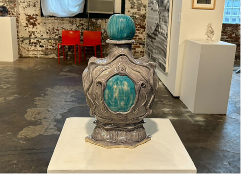
Installation view of Liz Wells, Perfume Bottle 4 a Giant, 2024, stoneware, ceramic glazes
Artist Website:
believe that art has to sell us a deeply personal story, and we are to then dissect this story. Liz didn’t want that to be her reality anymore. She didn’t want to take herself too seriously. As the person writing an “art commentary,” her philosophy is a breath of fresh air. As an art historian, I frequently see artists who have been pressured into a box they don’t find themselves belonging in.
When Everything Aligns:
blue skies at the Bunker Project
by Mercedes Perez-Shillington
On the second floor of the Bunker Projects on Penn Avenue in Bloomfield, a soil trench curls in on itself. The swirl reminds me of crop circles and portends of doom. Out of it, a myriad of plants including marigolds, dragon’s tongue beans, and carmen sweet peppers are slowly withering, dying, and curling in on themselves. At one point they were able to survive on this foreign floor, alien and cold, but their time has expired and no matter the soil beneath them, they have been cut off from essential sunlight and their time has passed. mass deceleration event is an instillation part of Lucia Riffel’s first solo exhibition in Pittsburgh since relocating from Florida.
In this exhibition, blue skies, Riffel personally greets visitors like an old friend with an artist statement letter written like a pen pal letter reminiscing on the end and the present and the world around us. Riffel’s work captures the slowly dying, cyclical patterns found in nature and combines them with the technology that surrounds us in the present age. We both rely on this technology for our advancement and ease of life, but at the same time it is escalating our own destruction. Is technology really bringing comfort and ease into our lives, or is it just accelerating it, pushing us further, farther, with no care for the end in sight? Riffel’s pen pal letter feels like a transmission lost in space, only preserved through the snail mail of the universe, reminiscent of when things were slow and achingly aware of the shortening expanse of time we have left.
“How are you? How could anyone possibly be? It feels as if we are bolting as people— throwing out our most dazzling flowers and our worst horrors— plummeting towards an end. And maybe we are nearing an end? Or maybe that is just what every generation thinks.”
mass deceleration event captures the swirling life cycle of the natural world. In it, small insects and organisms are surviving on the rotting plant life. Outside, this cycle would continue forever but indoors with no sunlight, it is inevitable that this cycle will end. This indoor crop circle is an omen of the disconnect between humanity’s pursuit of sterility and advancement and the natural order and chaos of survival.
Also in this gallery, installations include dried lemons and limes that have been carved with patterns, revealing the flesh beneath the peel lined up in a grid pattern on the mantle and threshold of the white fireplace. Along the windows which look out onto the foggy street below between yellow checkered squares, a variety of houseplants in hand painted glass jars with the same patterns from the grapefruits or painted blue skies with soft clouds. Along the walls are plaster shelves at knee and shoulder height with patterns of either rocks or grapefruit skin pressed into the surface. On the wall opposite the mantle, and on several televisions in the galleries, a trippy animation projects warping and shifting geometric forms. These pattern lay over each other, dizzying and mesmerizing.
“The gulf, the swamp, the heat, the endless varieties of citrus, and the year-round growing season are now a part of me. I continue to grow things here, and it feels small but magical. ”
These rhythmic animations combined with the perfect grids and lines formed within the installations makes me enter a meditative state, like entering a memory of a dream. You imagine these many fruits when they were ripe and plump with sweetness and remember their taste and the feel of their skin under your fingernail. Instead, here you confronted with this inventory, slowly drying and inedible.
Another captivating installation is in the second gallery space. There, a television screen lays flat on the ground and plays a looping animation of blue and green rippling patterns. Around the screen, triangular mounds rise out of the floor. Small lamps cast their shadows across the floor. Standing on the edge of the installation and looking down creates the illusion of standing ankle-deep in a flat body of water, sun sparkling off of the flat water. I found myself getting lost in the animation, on the precipice of recalling younger summer days of standing in water with nothing to do but feel the sun on my back and the salty grit on my skin. Like Riffel, I have reloaded from the southeastern United States, and I am still getting used to the gloomy beauty of grey Pittsburgh compared to the hot, sticky South Carolina sun. That heat is hard to miss when you are surrounded and swaddled in it… until it's slipped through your fingers and all that is left is the trace of soil under your fingernails.
“The light hits the water at just the right angle, and I see the green flash. The endless barrage of input and information changes frequency, and although the static does not stop, I can find space in it as a system I know how to navigate. I feel my feet below me on the sandy bottom. I lift, and float, and watch the clouds pass above. The water is warm, and I am water too. What makes it all make sense for you?”
Riffel’s relocation to Pittsburgh has greatly inspired this exhibition. The duality of being both indoors and outdoors and being immersed and yet separated by screens really pulls on the heartstrings of anyone who has relocated from the place they grew in and called home. This exhibition is a bittersweet memory capsule of a place so dear to you that even in separation it stretches across vast distances to be recreated in in the patterns of every day. Riffel has created their own meadow and their own swamp that feels like stepping back in your memory as an older version of yourself that can’t quite get back to that space and that version of themselves.
“My marigolds bloomed in a surprisingly brilliant yellow, and I see them as a mirror. Moments like this are when everything aligns.”
Lucia Riffel continues to work in the Pittsburgh area but currently has an exhibition at the Phaze 2 Gallery Shepard University in West Virigina. I look forward to seeing more of this artist and following them as they continue making these surrealistic memory capsules exploring the the presence of memory.
A Slow Look at Warhol
by Shawna Carter
Silently, I stood in front of an Andy Warhol piece, no longer just the common passerby as I had been moments earlier. For ten full minutes, I examined the eerie figures emerging from a set of sixteen screen prints. In that stretch of time, Warhol offered me a gifts of silence and solitude, so that all I could hear were my own thoughts while gazing at his Death and Disaster series.
Steeped in the present moment, I let the words come and wrote.
At first glance, I can’t help but wonder if she’s in pain. Did it sting, yielding to the burden of being a “traditional woman”? I can only guess that the chaos around her reflects the pent-up tension of a world’s weight, made heavier by passersby who seldom notice. I see how she’s the engine that keeps the everyday grind running; we are one in the same.
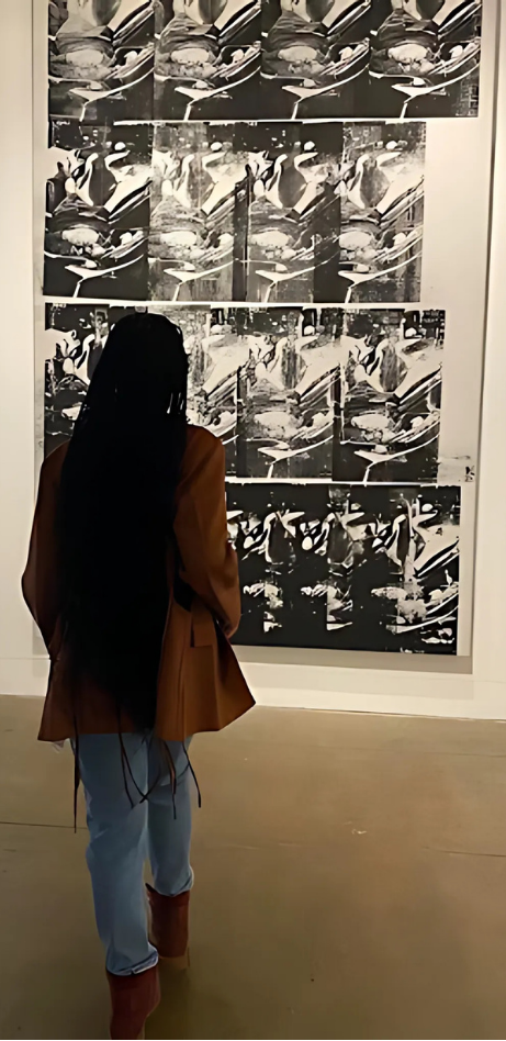
I applaud her flawless composure—poker face framed by makeup, blazer paired with silk-lined gloves or a handkerchief—while the shadows around her challenge me to decide what I truly see. Running the world can cause wrinkles to form, even the finest tailored pants, yet she crosses her legs with ease, as if telling any wrinkle to relax, because she’s got this. Barefoot, you stand tall against the repetition of patriarchy, and do it so beautifully.
That is womanhood.
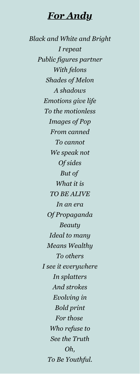
Soon after I recovered from my state of stillness, onlookers joined me in the site that I’d claimed for myself. I let go in an effort to gift it back to the world as Andy had done for me. Retreating to a bench positioned at the center of his masterpieces, I wrote a poem titled…
A Dance with the Ephemeral
by Lauren M Salopek
The bud's blooming breath
The potter's fired heartbeat
Limited, lasting
From the moment a flower is plucked for display in an arrangement, it has limited time left to blossom. Yet in that short time, it still has immense beauty to share. This interplay of life and (imminent) death is central to the Japanese practice of ikebana (literally “making flowers alive”), and of Contemporary Craft's 芸 [Gei]: The Beauty of Ephemeral and Eternal. Gei (meaning art, craft, artistic skill) brings together the fleeting beauty of ikebana florals with the enduring artistry of pottery and sculpture. Combined, these two art forms transcend the beauty of their individual practices and create something truly captivating.
Without seeing ikebana in person, it's difficult to capture exactly how different it is from an average bouquet. The practice is less “flower arranging,” and more akin to building a sculpture of flowers and botanicals. Traditional ikebana arrangements are works of art on their own, with the choice of vessel being fully incorporated into the design. Gei offers several stunning examples of this ikebana principle in its collection, among standalone pottery pieces and larger-scale floor arrangements; but one artist, and one piece in particular, commanded my attention as I made my way through the exhibit just after opening day.
On a display table of raw-edge wood slabs, Contemporary Craft has arranged a series of Japanese stoneware and clay pottery adorned with simple ikebana arrangements. Spaced so that any piece could take center stage in a viewer's attention, I was nonetheless drawn in by a small, abstract-shaped piece in neutrals of deep brown and bright white, with ikebana in coordinating colors. Glazed white stripes, placed with symmetrical precision, follow the curves and lines of the pottery's shape, which somewhat resembles an animal: an elephant with her trunk tucked in, or perhaps a baby tapir with its dappled white patterns. My first thought was, “She's cute,” but the longer I looked, the more nuanced and delicate my view became; the more fond I grew of this piece; the more alive it seemed. This is Dancer, by Miwa Neishi.
I can't claim to be an expert, but this kind of simplicity in nature's movement seems to capture the essence of the artistry of ikebana. That wilting petal drooping over Dancer's form is art all by itself. And the dead, dried buds that make the spectacular spray above it – where else but in ikebana could a flower no longer in bloom look so alive? And Dancer, too, is brought to life by the florals that adorn it: on its own, it is somewhat anthropomorphic, almost animal-like. With the buds and blooms added, it is a lifeform, so full of spirit that it looks as though it may begin to wander across the tabletop – or to dance.
Despite its humble size, Dancer was adorned, as of my visit, with a tall crest of dried brown buds; a vivid white chrysanthemum rested atop her “head,” almost like a crown.
Sogetsu Pittsburgh, who provides the ikebana aspect of the exhibit, will change out the arrangements every week throughout Gei's run; and yet I felt certain that no other arrangement could fit this piece so perfectly or precisely. It's more than the use of color, which is in beautiful harmony with that of the pottery: the gentle curve of the spray of dried buds looks as though it grew naturally out of the sculpture. Even a single drooping petal of the chrysanthemum looks as though it's mimicking the white glazed lines Neishi has painted onto Dancer. I know this is a simple accident of nature and that the placement of this singular petal could not have been planned or predicted by the person who chose this flower. But its perfection in alignment with the artistry of Neishi's piece was simply breathtaking.
Drawn by the promise of this ever-changing exhibit, I headed back to Contemporary Craft a few weeks later to see Dancer's new adornments. My certainty that nothing could have been more fitting than its first brown and white arrangement dissolves the second I see the piece again. This time, the energy is different, but no less alive. The tall, sprawling spray of buds has been replaced by a short, broad monstera leaf that appears to act as a parasol, shielding Dancer from the hot sun. Of course it's not a parasol, and the shady respite is from Contemporary Craft's lighting, not the sun – but once again, Neishi's pottery is brought so vividly to life by Sogetsu's ikebana that I can't help but imagine it as an animal taking its rest in the wild. Even the speckled insides of the pink foxglove buds seem to suggest something like an iris: placed right near the circular void of Dancer's design, this part of the composition appears more like an eye than ever. Resting this time rather than dancing, I feel like this piece is looking at me, engaging with me, perhaps about to give a wink and an offer to rest by its side for a while. I am astonished once more at how these two art forms can animate such spirit within the inanimate. My second viewing also brings to the forefront yet another aspect of Gei's presentation: the lighting. With the wide leaf hovering over Dancer, the play of light and shadow strike new notes in the harmony of ikebana. The slits in the monstera leaf cast small, symmetrical breaks in the shadow that echo the glazed lines of Neishi's work, not unlike the chrysanthemum in its previous arrangement. With the linework extending out, from pottery to botanical to shadow on the wooden display table, the dance between the art forms and their gallery space swells to the size of a symphony. It is not just clay craft and ikebana working together: it is the entire environment and the objects within it that become the art. I take Dancer up on its silent offer to rest: I stop, and try to linger in this moment where I, the viewer, am a part of the carefully-placed choreography of the exhibit.
Miwa Neishi's Dancer, accompanied by Sogetsu Pittsburgh's ikebana, embodies the greater success of Contemporary Craft's 芸 [Gei]. The exhibit combines fleeting art forms with more permanent ones in such a way that the space itself, and even the viewers within it, becomes a work of art. The constant change in ikebana compels you to return, with the promise that no two visits will give the same experience. Whether you take in the exhibit as a whole, or get pulled in by one magnetic piece, there will always be new details to notice and fall in love with each time. Come be a part of the dance. Let 芸 [Gei] take you on a journey— while it lasts.
芸 [Gei] is on view through January 18, 2025.
by Di
Do you know where The Bluff is? Officially straddled between the Birmingham Bridge, Fifth Avenue, Crosstown Boulevard, and the Monongahela River, The Bluff (also known as “Uptown” or “SoHo”) is a neighborhood in Pittsburgh notable for being the home of Duquesne University and UPMC Mercy. Not many Pittsburghers are even aware that besides the college and hospital, over six thousand people call the neighborhood home. Uptown has been through many transitions as a neighborhood; in the 1800’s, it was a refuge for the rich and powerful. In the first half of the 20th-century, it became a haven for the blue-collar factory workers along the river. In recent history, the neighborhood has battled with issues of foreclosure and empty storefronts, but the red-brick rowhouses and neo-classical architecture still have managed to stand resolute through the changing economics of the city. A point of pride for The Bluff is the public art that adorns many of the facades along Fifth and Forbes.
Jeremy Raymer is a multidisciplinary artist and muralist who has established his studio in Uptown. Raymer has multiple murals across The Bluff and likes to integrate the community into every new piece he creates. “I’m inspired by a lot of different things… I try to incorporate already existing elements and local history into my murals,” he explained. For Raymer, the public art in Uptown “gives a sense of ownership and pride back to the neighborhood.” Living in SoHo since 2016, Raymer has witnessed firsthand how the area is transforming: “I’ve seen a dramatic level of change,” he recounted, “there’s probably been three billion dollars worth of construction completed in the last four-or-so years. A lot of it championed by the UPMC hospital and new osteopathic school [of Duquesne].” Raymer also described how he often likes to take walks through the alleys of Uptown and sees the neighborhood as having become safer since he moved there in 2016.
Kyle Holbrook is an artist and muralist responsible for over 400 murals in the Pittsburgh area. Holbrook, who is also the founder of the Moving Lives of Kids Mural Project, is responsible for many of the murals in The Bluff. His works share themes of community, empowerment, and connection. “My relationship with the Uptown neighborhood is deeply personal,” explained Holbrook, “My family, the Stotts, are a large and influential family in the Hill District and Uptown, dating back to the early 1900s.” Holbrook’s practice philosophy involves him integrating his public art with members and themes congruent with the community. For instance, his ‘Penguins’ mural on Fifth Avenue included “a partnership with the Pittsburgh Penguins organization and included input from Pressley Ridge depicting Autism awareness…Families of young people with Autism collaborated to create the bottom part of the mural”. Holbrook reported that these personal and community connections “have deeply influenced my artwork, making my murals a tribute to the rich history and culture of the Uptown neighborhood.”
Uptown today seems like a neighborhood caught in many in-betweens. Some see it as valuable real estate that could be gentrified to be the next “hot” neighborhood in the city. Some see it as a place that has (in recent history) always remained relatively affordable in the face of a white-collar-izing Pittsburgh. Some see it as the spot where their families have lived, worked, and supported each other for generations. For many ignorant Pittsburghers, the neighborhood seems to serve the sole purpose of being a “thru-way” between Oakland and Downtown, and with the large upscaling over the entirety of the East End, this is becoming more true for many. The reality is The Bluff is a neighborhood teeming with culture, vibrancy, resilience, and pride. The many murals of the neighborhood reflect these values even more. In an effort to bring more awareness to the neighborhood, below are 12 murals that can be found in Uptown, as well as an accompanying commentary about the themes found within each work & their connection to the community.
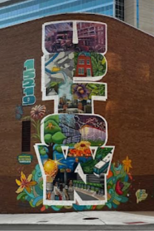
Corner of Forbes & Boyd ~ Max “Gems” Gonzales & Shane Pilster
This mural uses the typography of “UPTOWN” as a boundary to showcase the history and culture of the neighborhood. Electricity is also a theme in this work that references the energy of the community, Pittsburgh as an industrious powerhouse, and the very building the mural is painted on: a Duquesne Light power station.
Corner of Fifth & Magee ~ Kyle Holbrook (MLK Mural Project)
It is likely that hundreds of thousands of people have seen this mural driving down 5th Avenue before a Penguins hockey game. Not only are Pens superstars like Lemieux and Crosby featured on this wall, but the bottom half of the mural is dedicated to autism awareness imagery and symbols (like the puzzle piece). This interesting juxtaposition suggests that Holbrook enlisted the help of community members, including neurodivergent folk, to aid in the creation of this mural. In fact, Holbrook’s “MLK Mural Project” is designed to do just that: to have community youth help design and create works of public art around the country.
Corner of Marion & Fifth ~ Jeremy Raymer
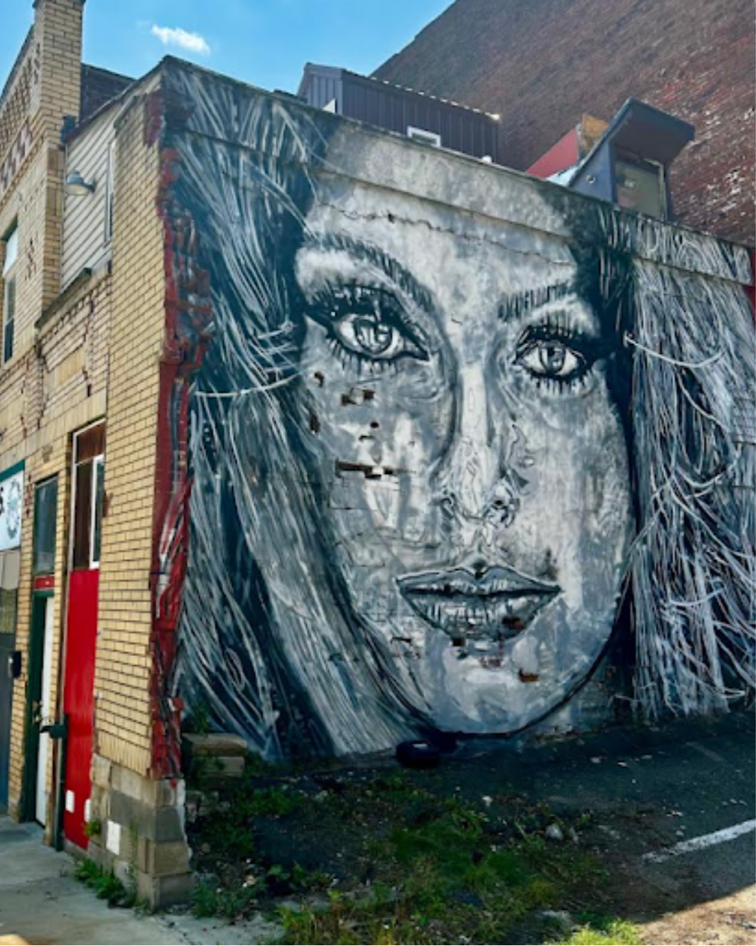
On the side of the legendary Merante Bros. Market, a portrait of Sophia Loren gazes out onto Fifth Ave. For Raymer, he wanted to connect the beauty and timelessness of the 1960s to the resilient culture of the neighborhood. The mural also, with tongue-in-cheek sensibility, advertises that for this community, beauty doesn’t fade.
Duquesne University ~ Gerry Tonti
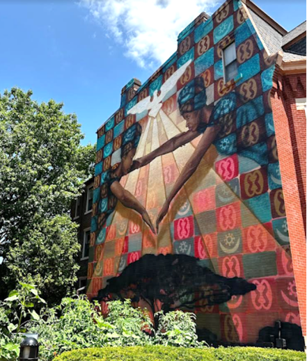
I Am Because We Are is a mural painted on the side of the Laval House on Duquesne’s campus. The piece integrates West African symbolism, like the Kente cloth and Baobab tree, with the Spiritan theology of Duquesne. The result is a piece that balances connection and power, human and the divine, Africa and America. The mural now guards Duquesne’s community garden.
Intersection of Tustin & Seneca ~ Jeremy Raymer
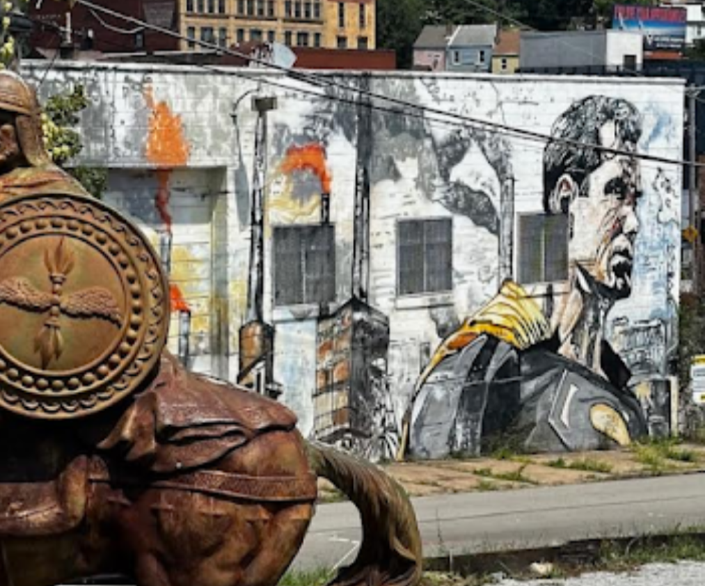
This work-in-progress mural features a somber and stoic Superman staring down the Monongahela River, while the fires and smokestacks of Pittsburgh’s industrial years burn and smog behind him. Could Superman be looking towards a new vision of the city, or do the fires represent a new foe who cannot seem to be put out? This piece also has an interesting neighbor: a seemingly-bronze statue of a viking on horseback. I could not find a placard about the origin or creator of this Norse monument.
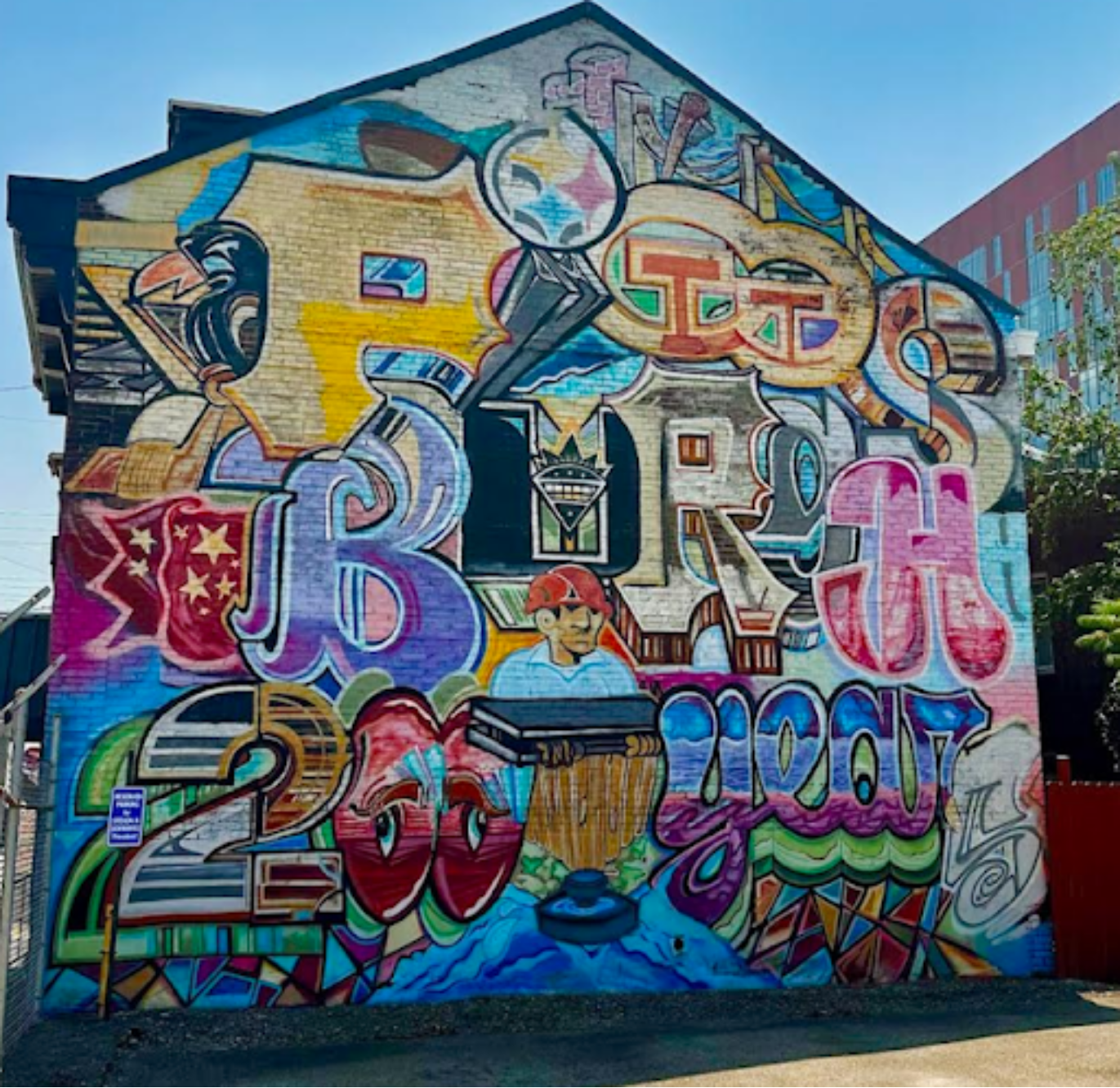
Corner of Van Braam & Forbes ~ John Maurice Muldoon
This mural uses the symbols of Pittsburgh to portray the growth the city has had for over 200 years. The references are pulled across sport, transportation, time, industry, and identity. In an ever-changing city, part of Uptown’s charm is that so much of the turn-of-the-century architecture remains. The placement of this mural then complements an area that, for many, feels like “real” Pittsburgh.
Corner of Fifth & Miltenberger ~ Kyle Holbrook (MLK Mural Project)
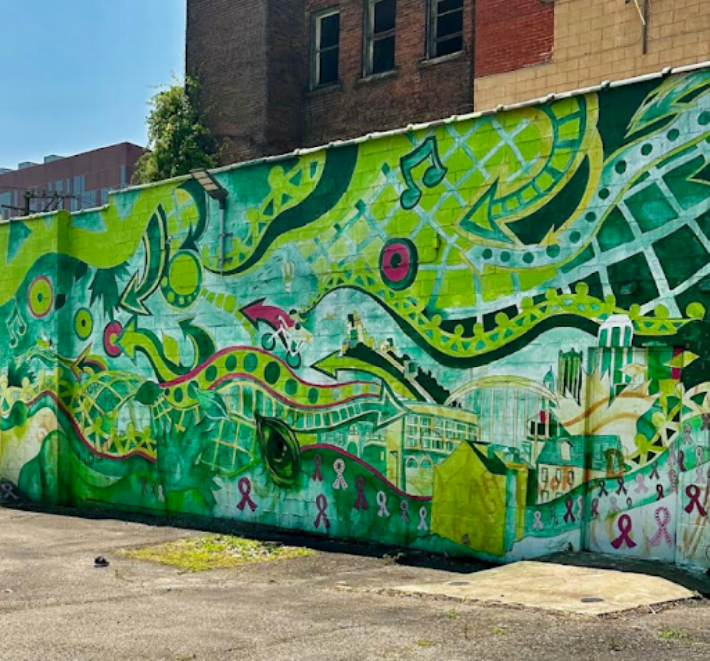
In this piece by Holbrook & MLK Mural, green abstractions flow between images of Pittsburgh, people holding hands, and blips of pink, meant to honor breast cancer awareness. Made in partnership with Highmark’s Caring Place, this mural exists in a superposition between a celebration of a local community and a memorial for those who lost their battle with cancer.
200 Block of Gist Street ~ Luis Castellanos Valui
This piece is not a mural, but instead installed and framed upon the wall of the Pittsburgh Association of the Deaf. A Jazz quartet rides a bike across a bustling cityscape, guided by the help of a flying female muse. American Sign Language references also appear as neon signs in this Pittsburgh-like skyline. Overall, this piece blends Modernist and Expressionist styles to create a piece that feels serene yet dynamic.
Corner of Forbes and Gist ~ James Simon
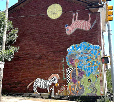
Bass Man and Moon is a mosaic that was made with the help of kids from the ACH Clearpathways program. Jazz is a theme common amongst the works in Uptown, relating to the African American roots of the community and serves as a reminder of the once bustling jazz scene of The Hill. The two zebras, one black-and-white and one orange-and-pink, symbolize the creativity that comes from music or artistic expression. I see this piece as also having a deep connection to unconscious activity.
Corner of Van Braam & Tustin ~ Kyle Holbrook & “Camo” Nesbit
This piece serves, like others in the neighborhood, as an ode to expression and creativity. We see in the mural a fellow who plays saxophone in such an expressive way that out of the instrument’s bell, butterflies and bubbles spill out onto the rest of the aged brick on the building. We see not only the beauty encoded with artistic passion, but the playfulness it often brings as well.
1417 Fifth Avenue ~ Gregg Valley
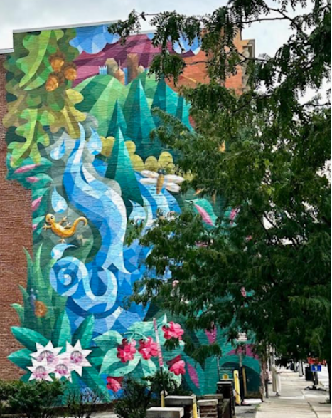
In this fantastical work, Valley replaces the concrete and clay of Uptown with a vision of a vibrant and unexplored woodland. Off in the distance, one can see the downtown skyline through the treetops and vines. What does this work convey about the present and future of Uptown? Is it waiting to be pioneered? Is it an oasis away from the industrialism of the city? These questions circulate in the reader’s head as they take Fifth Ave deeper into the city.
Corner of Forbes & Seneca ~ Gabe Felice
On the side of Merante Plumbing is a psychedelic whirlwind of birds, faces, and clouds. After a a minute of gazing, the foci of the work emerge: two heads in conversation (a la Pink Floyd’s “Division Bell”), a giant canary staring at the drivers going down Forbes to Oakland, and a bright, wormy creature who dons “SoHo” on their side. SoHo is the outdated name of the neighborhood, and this moniker pairs with the weathered look of this mural, as well as the green overgrowth sprouting through the gravel lot and the old building around the block. This artwork symbolizes and gives a time and space to the idea of “life after death.”
THE MANY MURALS OF UPTOWN
The Journey Towards Finding the Piece I Like:
Learning to engage with a piece of art in a new way
by Vania Evangelique
How do you hold space for interaction in an environment that begs you not to touch. Not begging per se, but demands with its insistent signs, roaming gallery attendants and cameras at every angle.
How do you place such delicate pieces of artwork that calls out your name, begging for the touch that only your hands can bring. Betwixt the cameras, attendants, and your body’s natural urge to experience this life, this moment, in all its senses. How do you curb that pleasure? That ache? That want?
Well. You can do so through an ipad that mimics the feeling of sweeping through an artist's sketchbook. Equipped with the look and sound of turning pages.
Minus the true touch of it.
Minus the true smell of it.
I found myself more interested in the process and less about the work itself because of this. How the institutions decide on its framing. How the artist used certain materials over others.
Certain colors over others.
Certain framing over others. The sizing of the pieces I find myself curious of as well, along with the ways that they engage people into the practice of only looking.
During the time I spent, I asked the gallery attendants what their favorite piece(s) were..
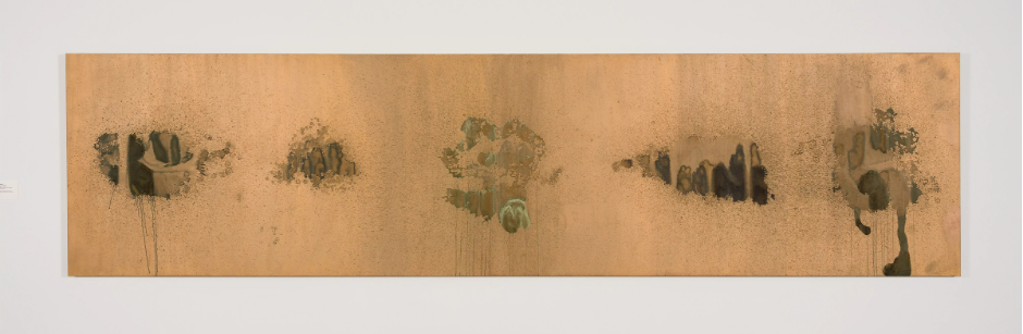
Oxidation.
Floor 5 was one of them.
I can see why it made him chuckle. We can’t touch the artwork. But we can hang canvas coated in copper with strangers piss on a wall for us to see. At least for this piece I’m grateful we’re not allowed to touch the artwork.
Another attendant. Shy for some reason about her favorite piece.
The Birth of Venus.
Floor 4. No shame necessary, that piece with its inverted colors, the flowing of her hair. I can see why that’s her favorite.
And yet, even after battling the urge to touch every piece I could find, (minus the ones covered in piss), speaking with strangers regarding their own favorite pieces. I found myself walking up the steps from the lobby, to discover my own.
There’s something mesmerizing about looking at disaster. Being in the midst of chaos and yet so far removed from its grasp it allows for a deep exhale and inhale and exhale again. I took some time standing directly in front of the carnage. The destruction of Floor 2 of the Andy Warhol Museum, Floor 2 and Part 1 of the KAWS+WARHOL Installation. There’s something captivating about that blood red. The vibrant hues of multi-colored chaos coordinated into the symphony that crescendos that land to a point.
I kneeled in front of the piece Ambulance Disaster, almost as a prayer.
Juxtaposed against its white walls, the middle gray backdrop, darkened gradients of black and whites, and double exposure of a singular image. The top image is clear yet faded, its duplicate underneath faded and yet showing more the moment of this Disaster.
I feel like I’m there, in that top black and white image of the man's body flung out of RO 3-5777. His body crucifixed against the door of the vehicle, adorned with a black leather jacket over top of what resembles a flannel.
(I wonder if it was cold that night).
Hair, low hanging. Windows and surroundings blackened, dark. The piece of the perpetrator,--another vehicle– seemingly an inch away from the deceased head. The top image, faded yet clear. And yet, this bottom image clearer in its reproduction of Ambulance S e r RO-3-6777.
I can see the medical equipment in the back more clearly and greatly defined is the passenger side window directly in front of the face of the victim.
(I wonder if he saw himself before he went).
And yet, in this reproduction of a bottom image, the man himself has ascended. His face, neck blurred and semi-erased.
Ethereal and spiritual.
The trail of blood, or oil, or gas, or water, the liquid cascading down bringing your eyes and attention to KAWS. A monochrome sculpture, face down, the palms of the hands and feet facing up (almost as a sign of surrendering its own ghost). The hands, mimicked the position of the victim forever memorialized on the linen, his essence transformed to the dust that lays on this silkscreen reproduction of the Ambulance Disaster.
This larger than life creation, this full body sculpture has me thinking.
What a way to go out, in the very thing sent to help.
And maybe art, galleries, and institutions can exist without the need to thrust our entire being into it. Physically that is. By touch that is. And that our very molds can be melted into the scene of an image.
If we find the right one to look at long enough.
Oxidation, Andy Warhol (1978)
Photo Courtesy of the Andy Warhol Museum,
INVERSION IN PITTSBURGH
by Bea Schneider
On an August day, I got the chance to go to the studio of Masha Solus, a watercolor artist currently living and working in Pittsburgh, Pennsylvania. Our conversation was both honest and vulnerable, discussing art and its personal impact for Masha. Masha began our conversation speaking of how she grew up in Moscow, a place that has shaped both her art and identity. Vulnerability and distortion serve as central themes in her work. Immediately, it became apparent that she engages viewers directly. Invitations for them to question their own perceptions are sprinkled throughout.
Masha’s education in Moscow took 12 years to complete and after those 12 years she learned that the classical tradition was something that didn’t work for her. Artists in Moscow start learning philosophy first within their education, which took about five years. Her classes were based in both art and philosophy. Masha suggests for new artists to start with the history of art before starting the art itself, and feels that this is an important step in being an artist. Masha moved to Israel in 2014, where she continued her studies, learning conceptual and contemporary art. The combination of the two allowed for both thought and impression. She remained in Israel for eight years. In late 2021, Masha said she started creating modern art. A few months later Masha and her family moved to the United States, around the time that Russia invaded Ukraine. Masha realized that her opinion of this war was different from those of her friends and relatives. This is when she started applying the technique of inversion to her art.
The language of inversion began in Masha’s art when she thought about the complexity and confusion going on around the world and how people felt about conflict. She experiments with various mediums of paint to show this, such as watercolor, oil, tempura, and acrylic.
Her current process is methodical. Conceptualizing; contemplation; the writing out of texts and concepts can take six months. All of which takes place before Masha begins.
Her painting above shows a conflict between visual messages and text messages. The viewer is invited to touch the canvas, as braille lays at the foundation of the work, on the girl’s body. Touching paintings is a new concept to me and it is never my first instinct to touch the artwork, as most museums and galleries have strict policies about getting too close to the art. Masha said that once you touch the paper you are participating in an act of destruction, and this is her provocation. She isn’t commenting on whether something is “good or bad”, but that “it happens”. That is how it is. The main concept of this piece is about conflict, visual messages, and text. Masha’s fascination with braille began with her fascination with sculpture, as that is another way that allows people to touch artwork. Masha uses the braille to provoke people to touch the artwork.
In Braille are quotations from A Report on the Banality of Evil, a book by the philosopher and political thinker Hannah Arendt. Masha’s work meshes paint, text, and philosophy. She described that her artist techniques were a result of how she felt when the war escalated.
Masha’s process allows for research on the way that aggression settles within oneself. The language of inversion enables dynamic exploration. Inversion pushes one to think differently and brings about questions that are new, perhaps even those that may scare the viewer.
In 2023, Masha’s mother was diagnosed with breast cancer, just ten years after her father passed away from lymphoma. This was the second life factor that affected her work as she began Project Karkinos.
Cancer has deeply impacted Masha’s life and has been a present throughout her family history. She has worked to dissect and explore its impact through her art. Masha created a series of portraits of her mother during the time she was diagnosed with breast cancer. The portraits were based on photographs of her mother when she was in chemotherapy. These paintings were based on images, but they were also inversed, examining how her mother’s life and body was taken over by something else, something dark. Beauty and the vulnerability that comes with it, is also examined through the portraits. Within this series, Masha also painted weeds and other forms of plant life. By depicting tough species that spread quickly, she broadened her exploration of cancer’s presence, using botanical metaphors; mirroring the disease’s persistent growth.
Paintings, such as the one below, project a more ominous feeling within the viewer as they stare into the eyes of the figure. This is intentional. Confronting images of cancer and fear were difficult for Masha, but these images forced her to come face to face with reality, even if it is hard. The work may challenge viewers to come face to face with their own fears. To not avoid the fear, but to discuss it. She said art doesn’t always necessarily need to be beautiful, but offer provocation.
Before coming to Pittsburgh, Masha had lived in Chicago. I asked her about the art worlds of the two U.S. cities she has spent time in. Masha explained she felt there are a lot of strong artists and masters within the art world in Pittsburgh, a place she has now lived in for more than two years. She said she feels more warm in Pittsburgh, but couldn’t compare the cities because they are just too different.
While in Pittsburgh, Masha began projects and research that look into her family’s past and cultural legacy. Masha’s father was a physicist and mathematician. Her Family History Project uses a book taken from her father’s library titled Theory of Solid State. Even though Masha said that she does not understand the mathematics within the book, her lack of understanding works as a metaphor for not fully comprehending her parents and family history. This book explores the roots of her family, holding precious artifacts such as photos, text, blueprints, and locks of her mother’s hair from when she was in cancer treatment.
Masha said that she is trying to explore the history of her family even though she is limited and won’t fully understand until the very end. Some of the figures within the book are “lighthearted and diary-like”, as she described that she drew and wrote things that have happened without any thought. Masha explained that some of the drawings were purely just for fun. The cover of the book is a multi-layered inversion illustration that was based on a photograph of Masha and her sister being pushed in a stroller by their parents. The photo on the cover was a candid shot that was found in a Moscow newspaper. Her perspective here is explored through inversion.
The blues, greens, and cool colored tones that are very present within Masha’s work are inspired by “code blue”. Code blue is most commonly known for recognizing that someone has gone into cardiac or respiratory arrest and that there is an urgent need for care. Her brushstrokes are full of intention and the colors work to create an inversion of color. She got the chance to show me the language of inversion through her iPhone, using the composition section in her camera to invert colors to change how content is displayed on her screen.
Masha is currently working on finding her identity, which includes a history of her family and the impact that being Russian has had on her. Her aspirations for the next project is first an exploration of her family roots.
As Masha continues to explore her identity she is also exploring Russian cinematography and folklore. Within the text and film regarding these subjects Masha said she has found a lot of aggression. She uses famous images from Russian cinematography to speak through languages of inversion. The inversion is applied to make people think differently about the story at hand, maybe even ones they grew up hearing. Masha also explores the aggression within Russian film and literature through her process of inversion. She said the same process works for both folklore and fairytales. One of the films she is currently sketching is from 1980, titled “Moscow Does Not Believe in Tears”. These are her sketches for future work and her next project. She hopes these projects will push people to “start thinking” as she believes artwork is an important tool in the way it speaks to people.
A perfect art world for Masha is one in which people are willing to embrace and consider the feelings, the noises, the perspectives that art brings, openly and without limit.